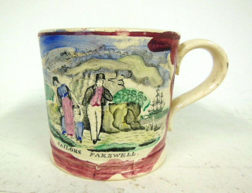
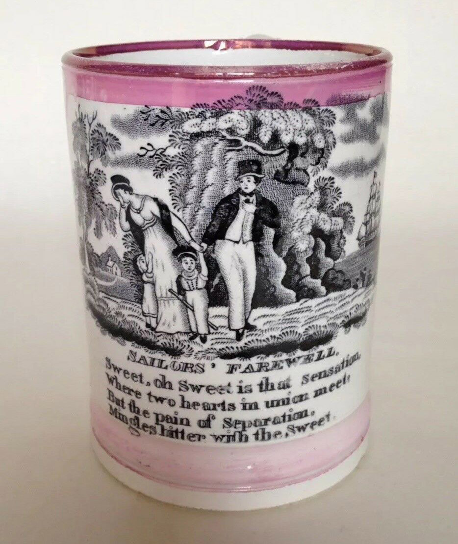
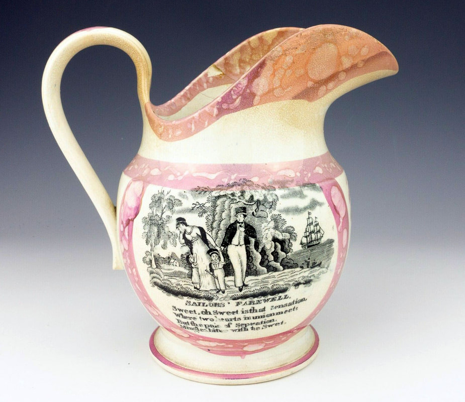
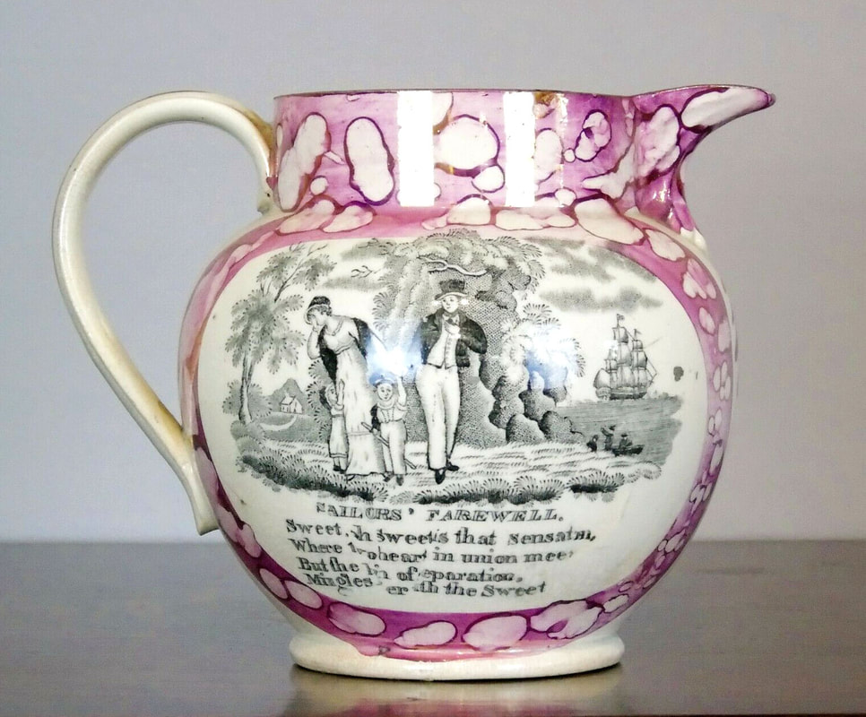
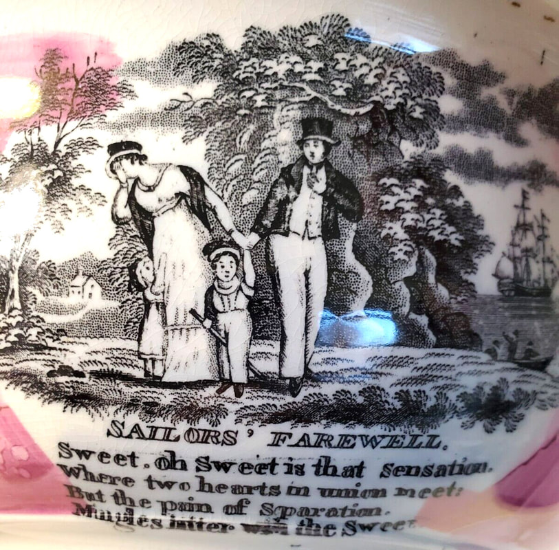
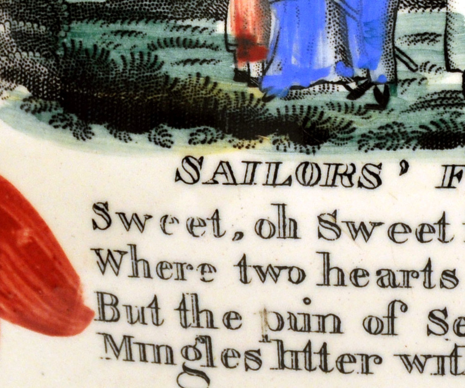
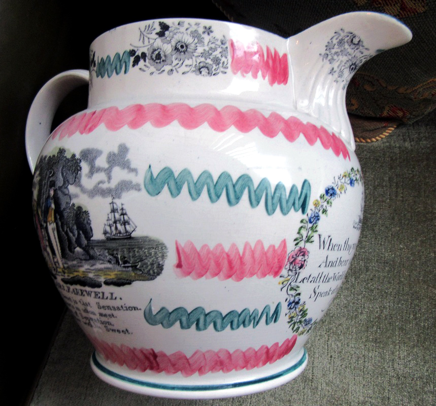
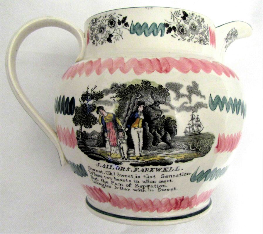
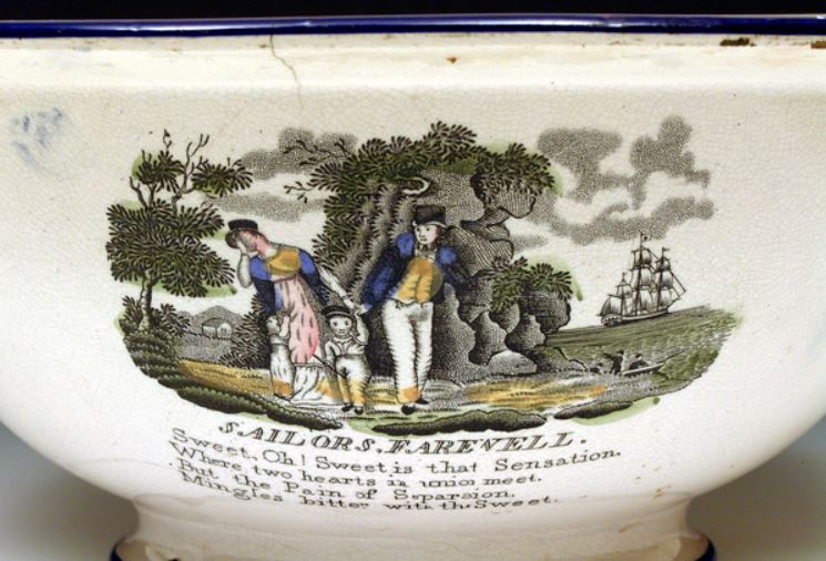
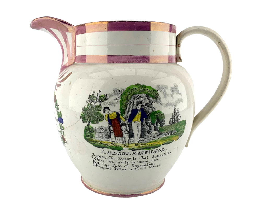
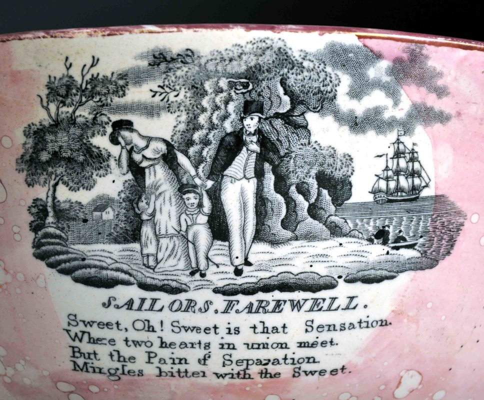
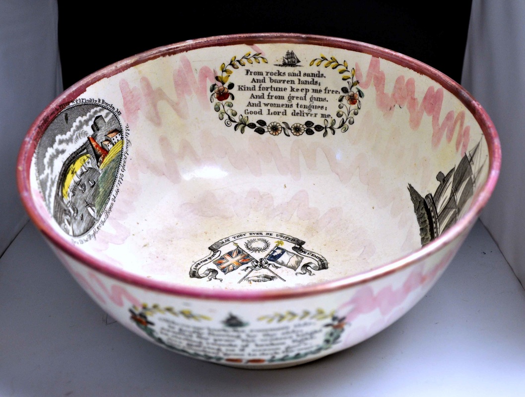
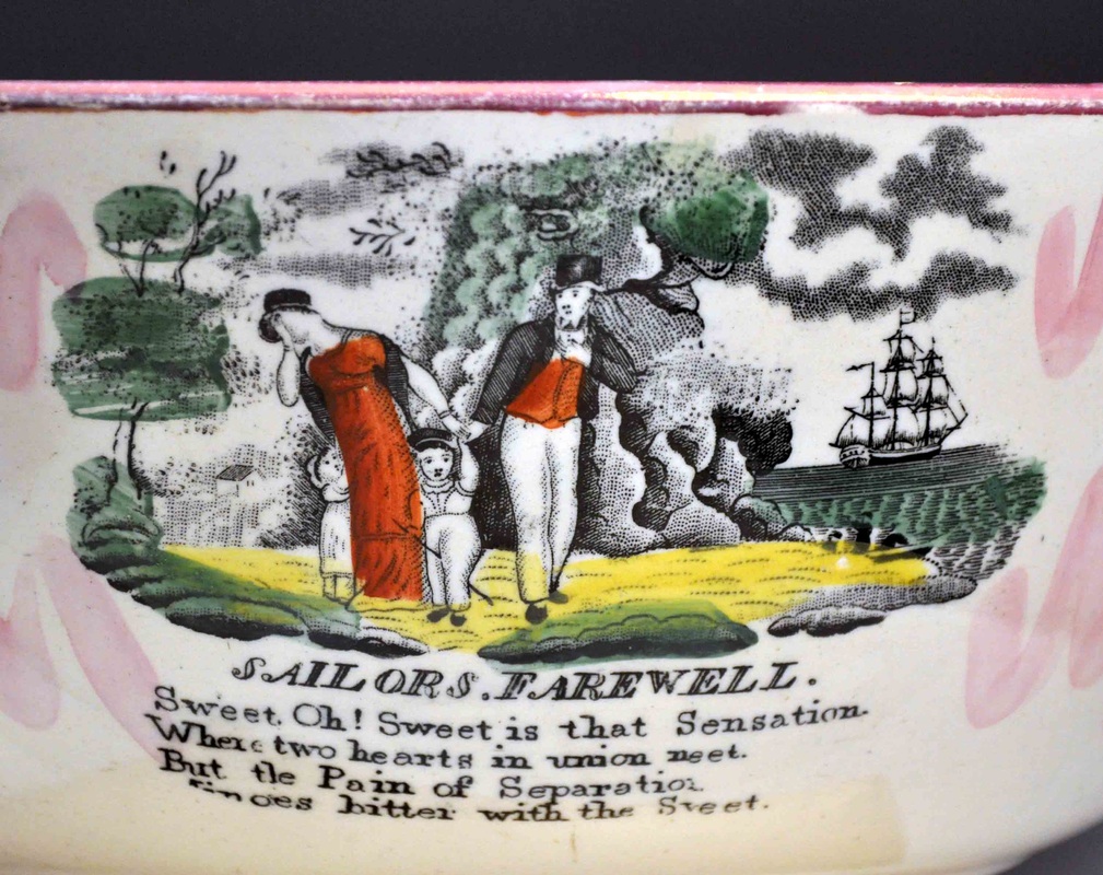
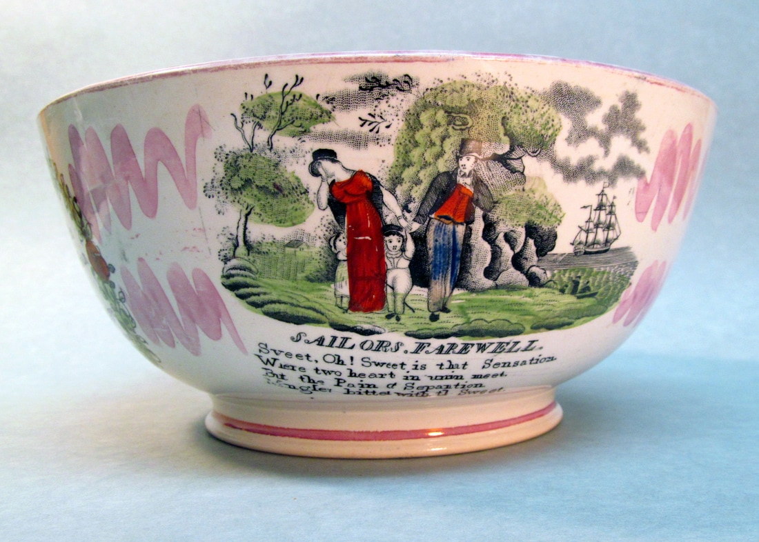
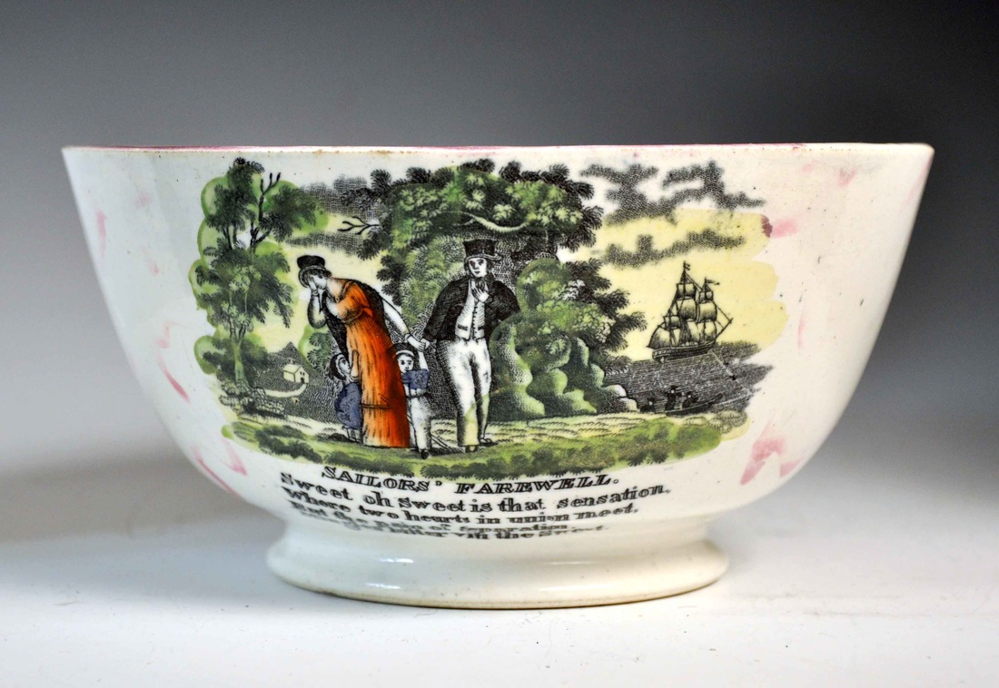
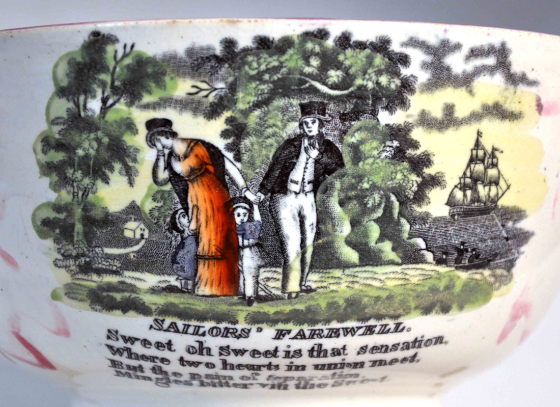
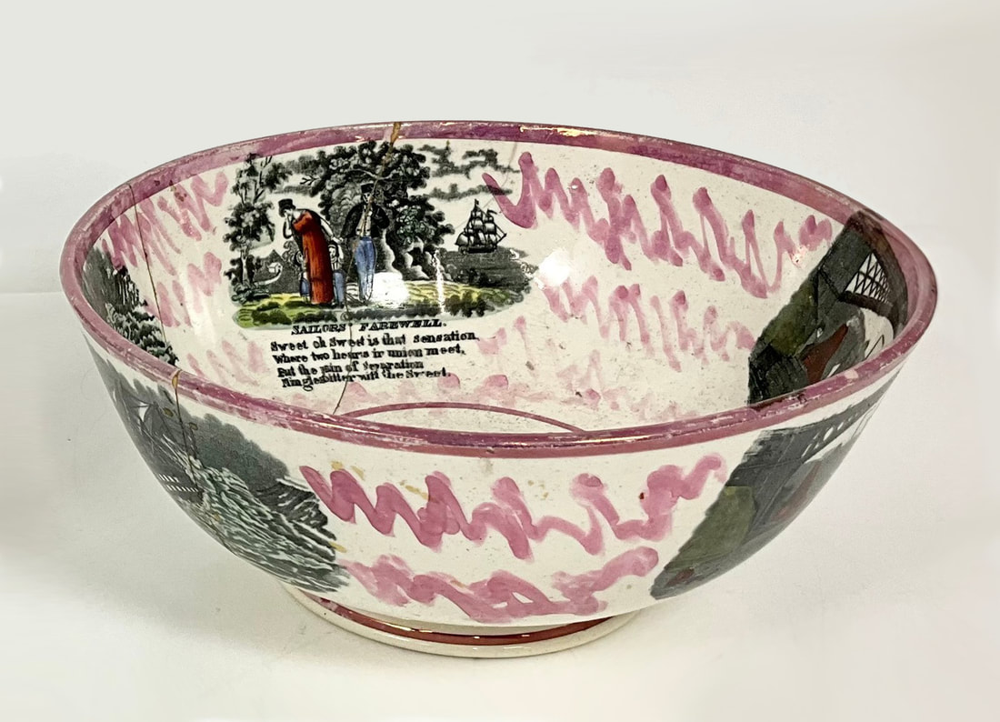
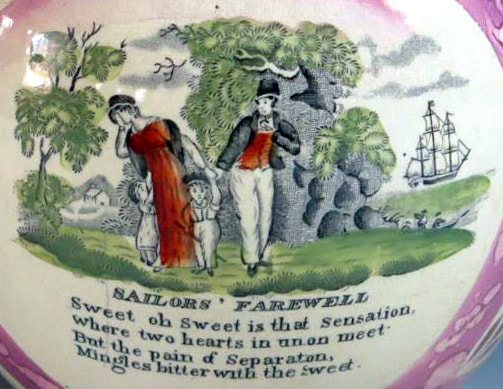
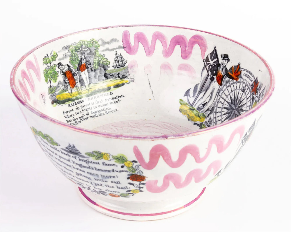
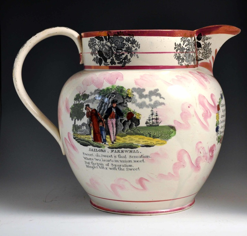
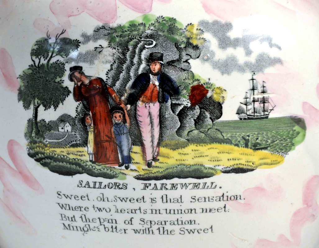
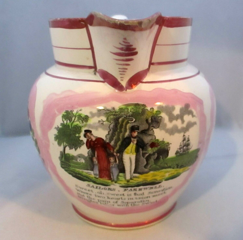
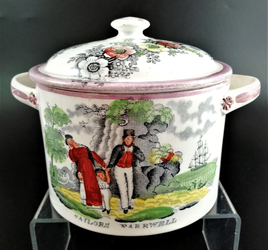
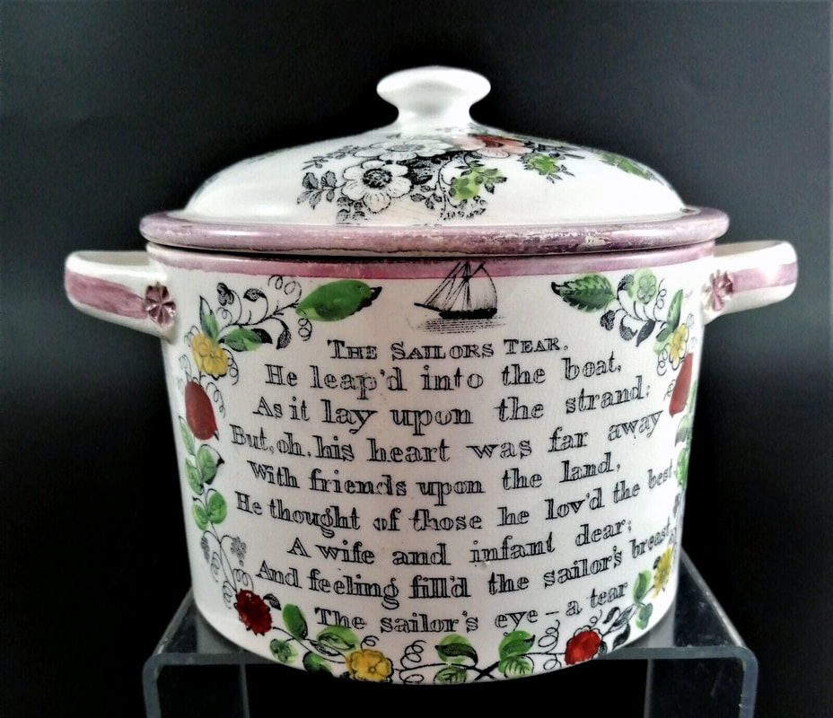
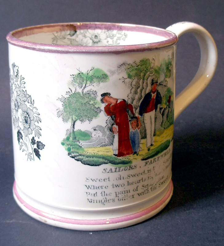
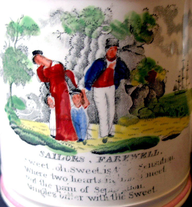
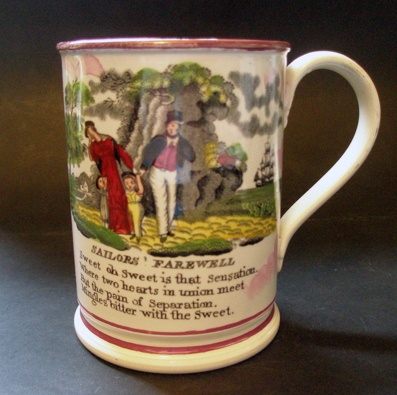
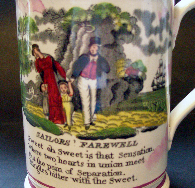
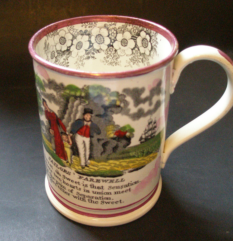
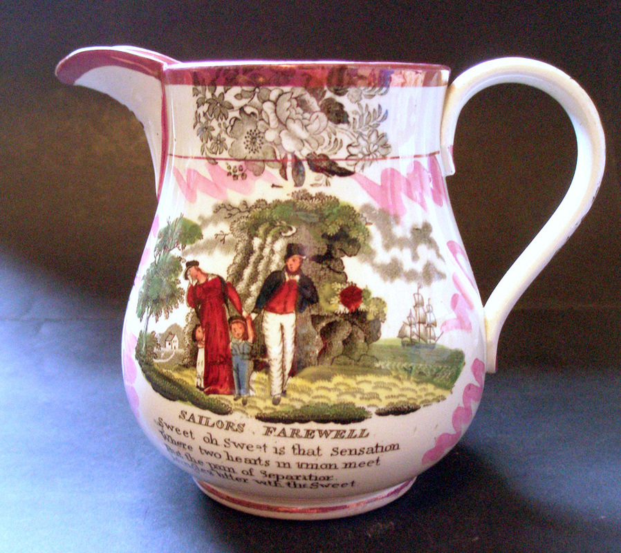
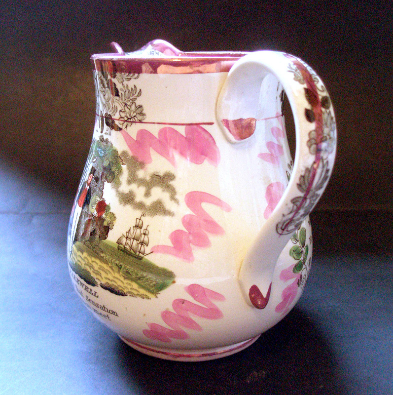
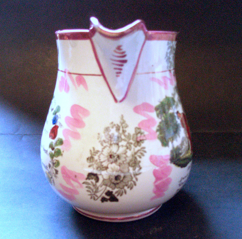
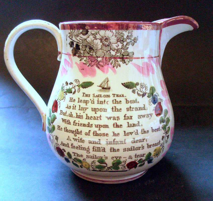
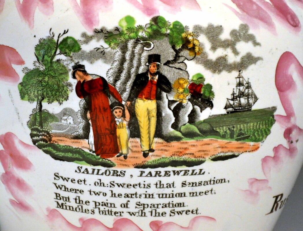
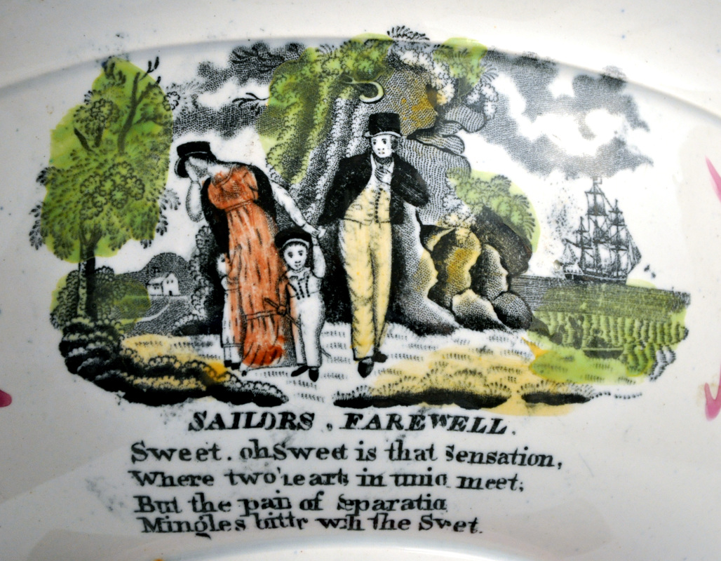
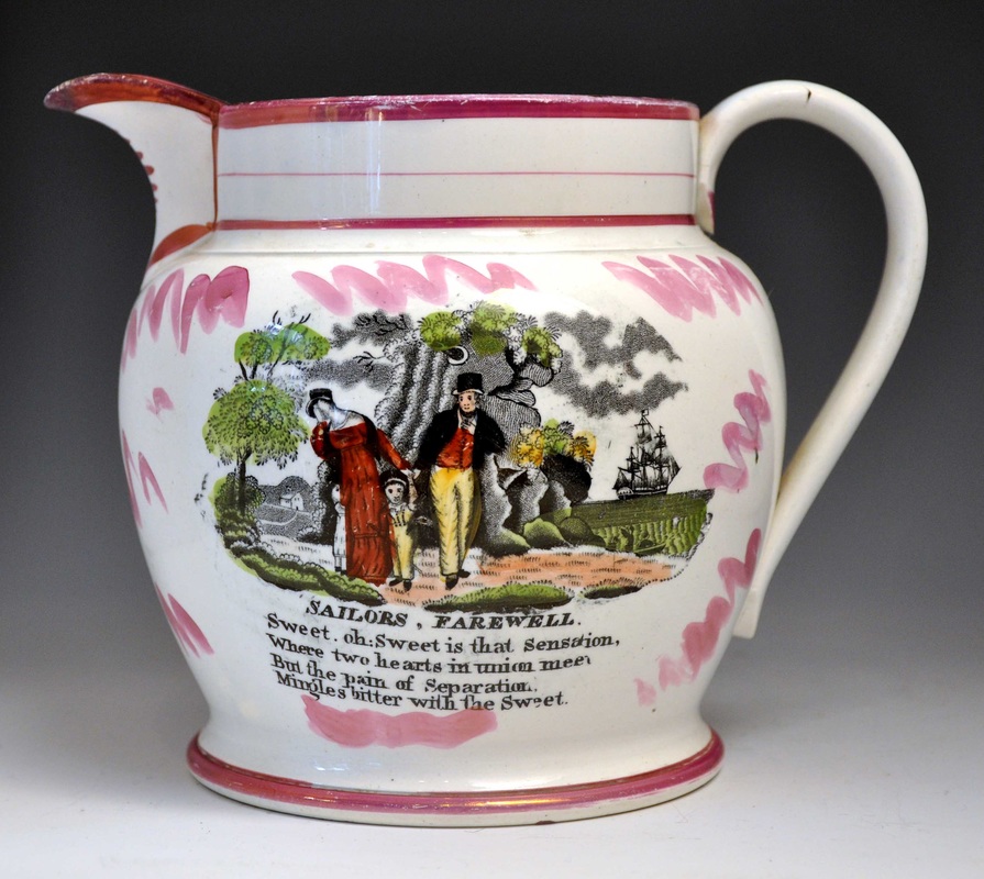
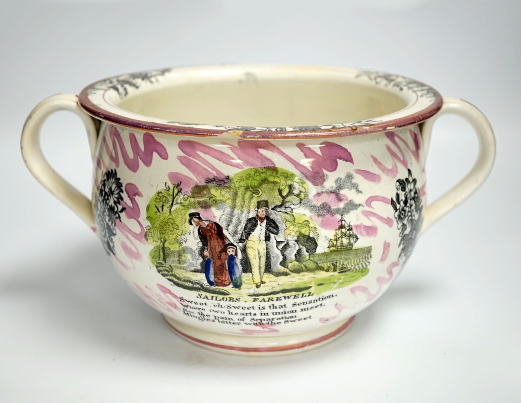
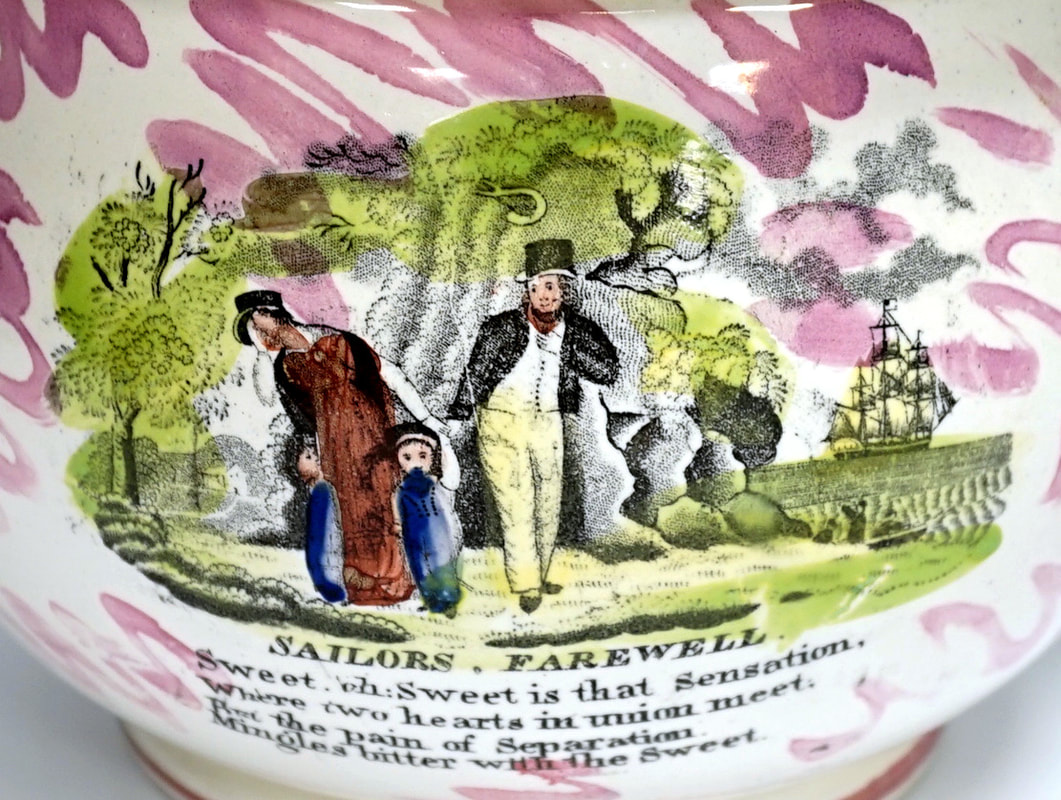
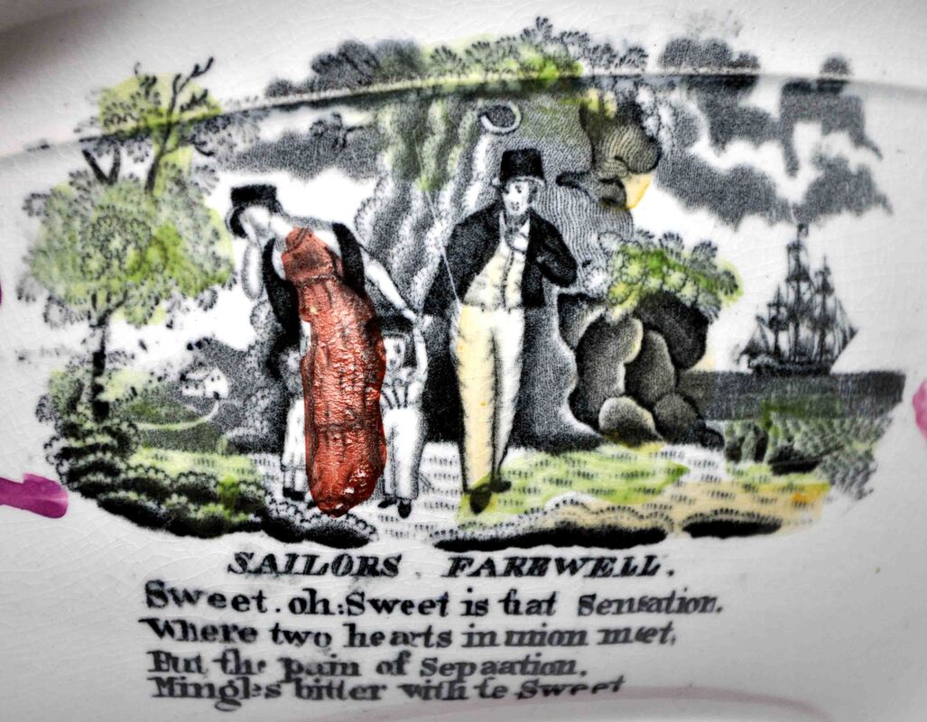
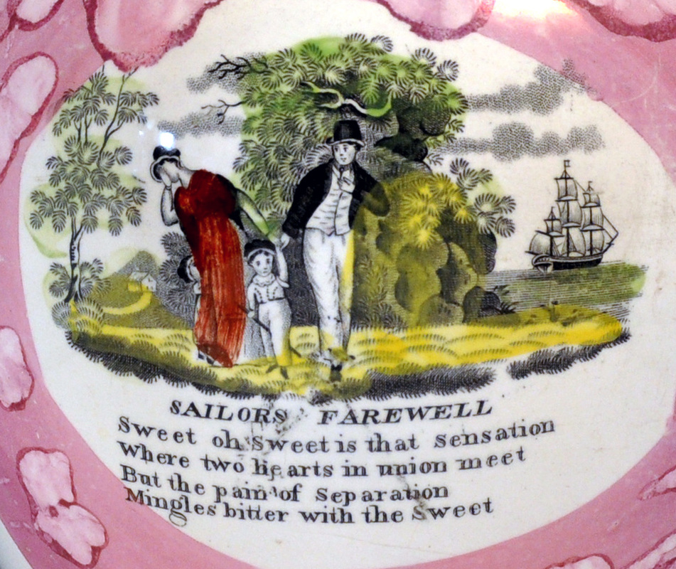
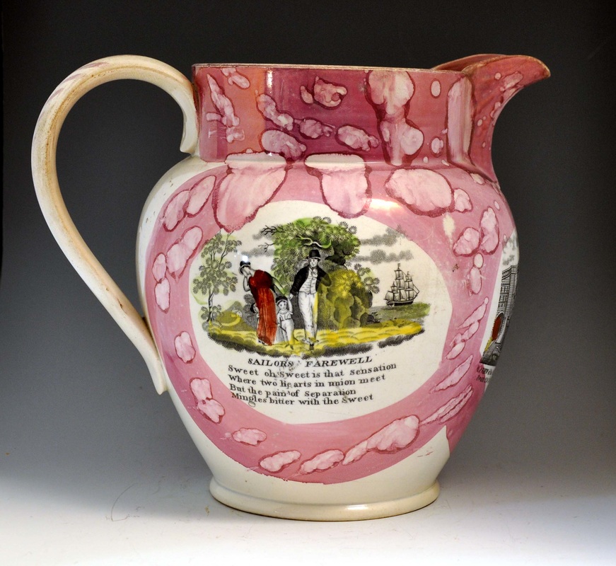
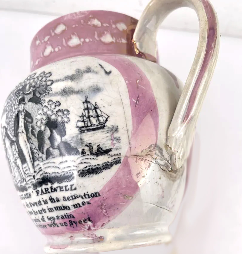
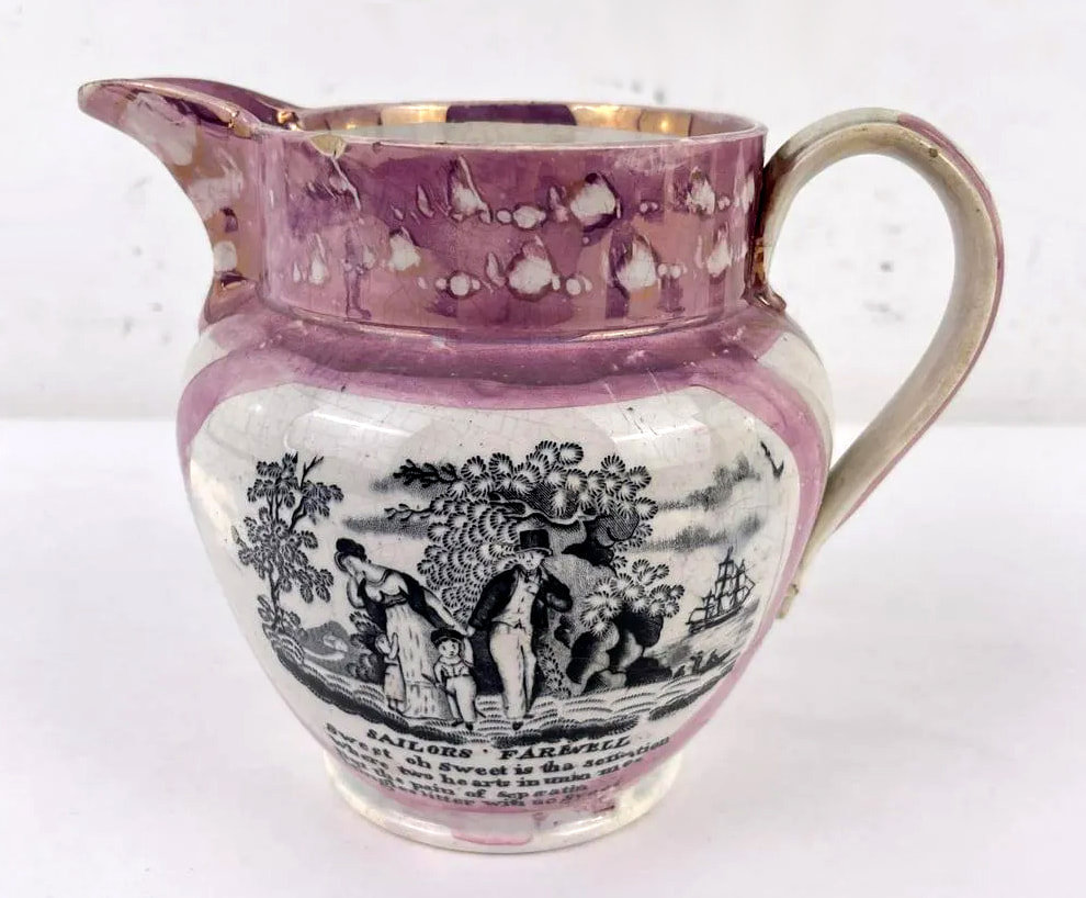
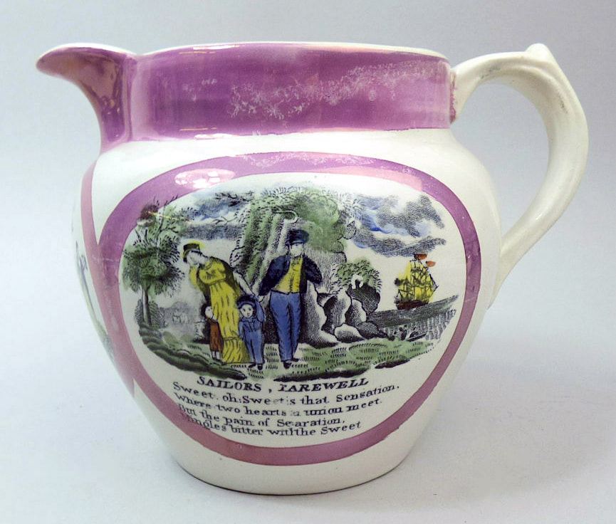
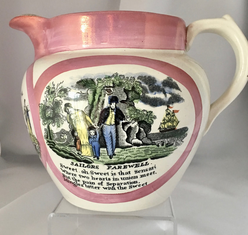
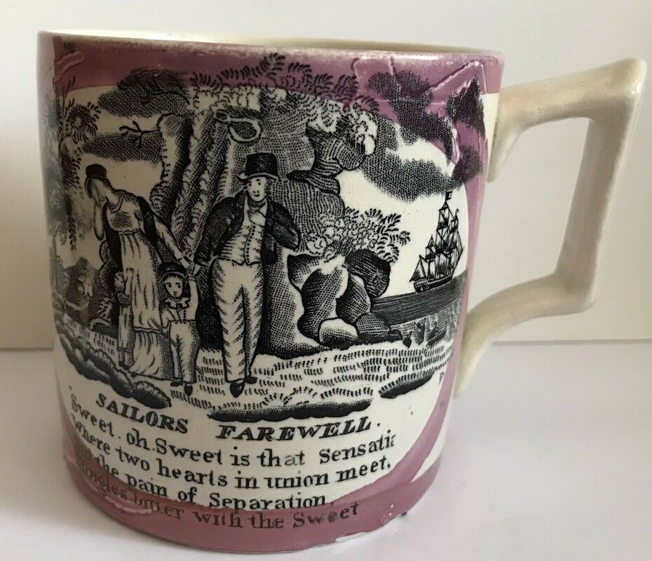
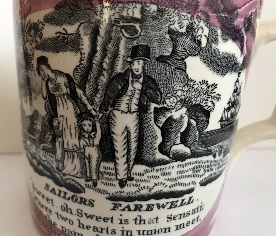
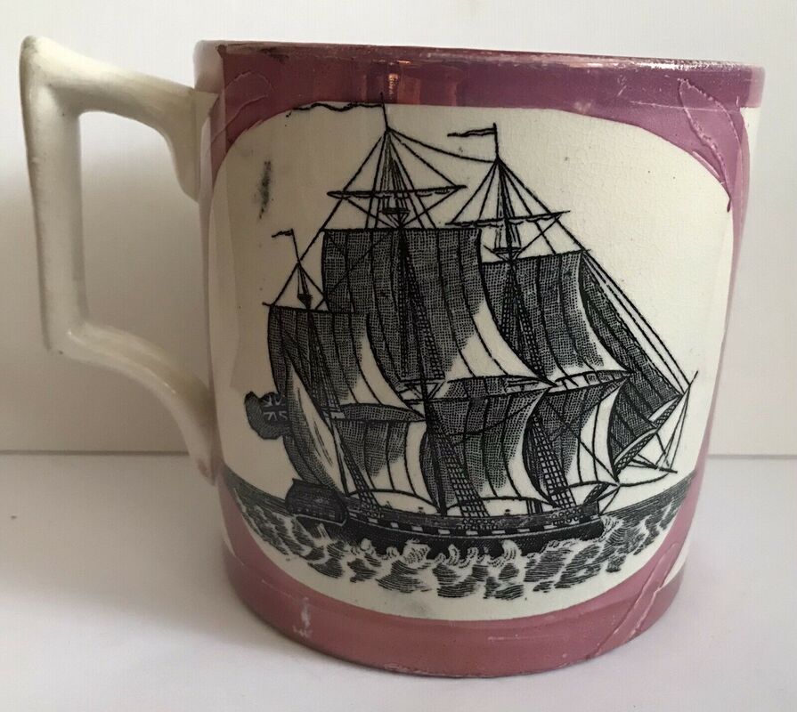
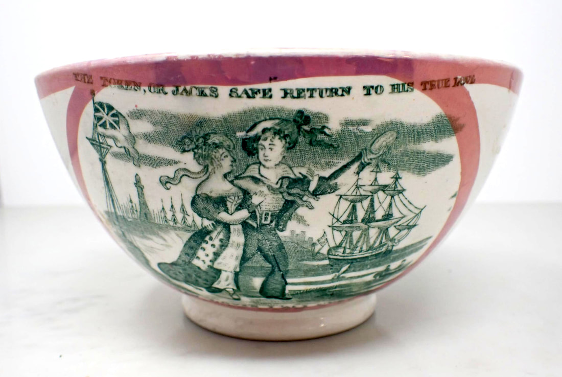
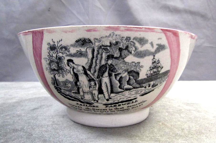
Sailor's Farewell – Sunderland
Garrison Pottery 1
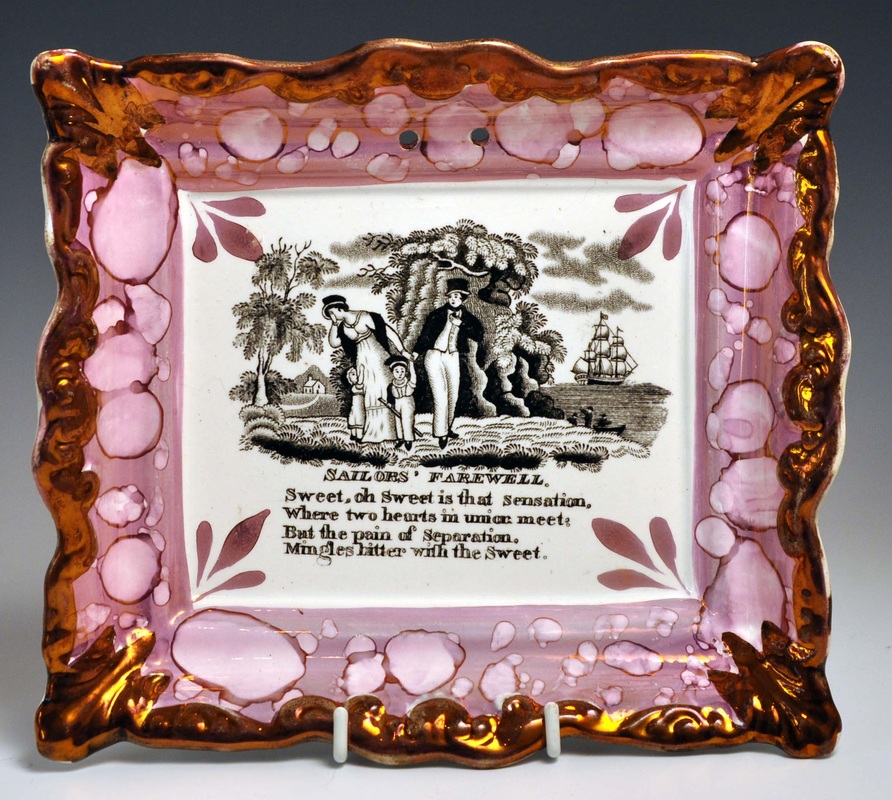
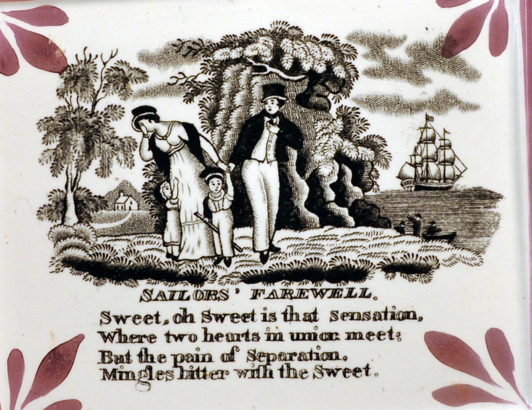

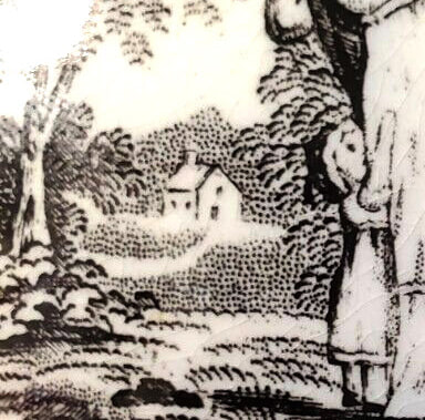
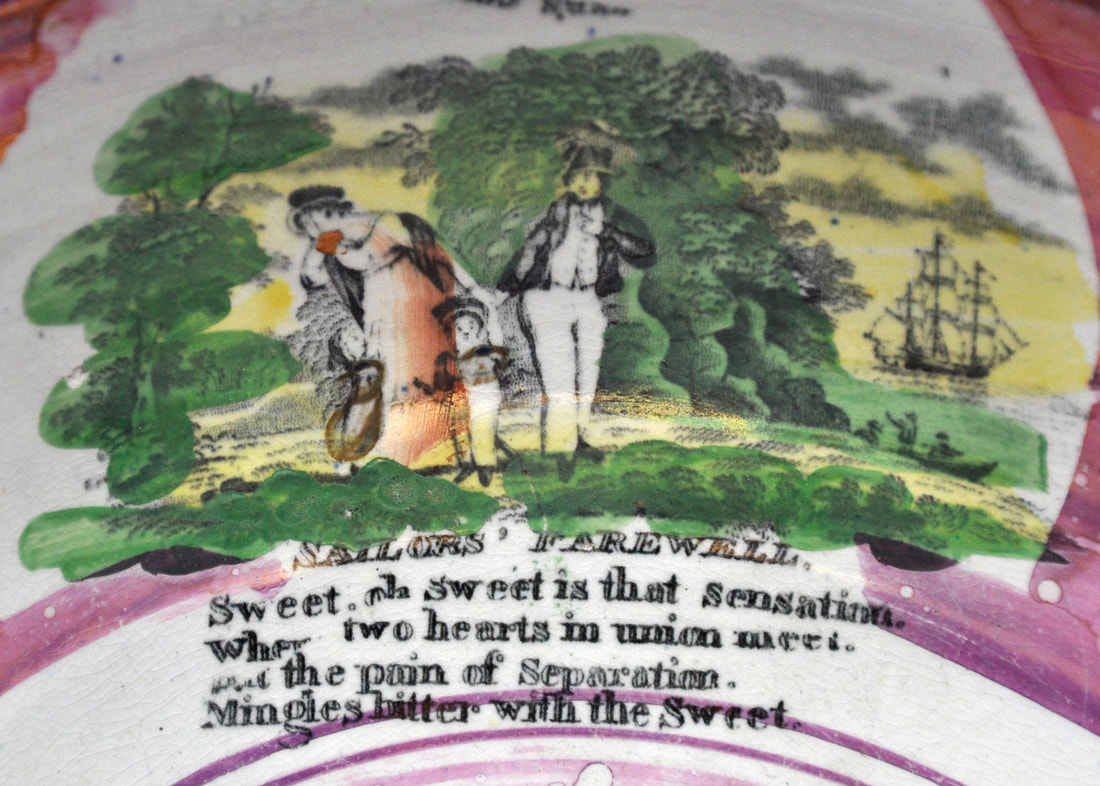
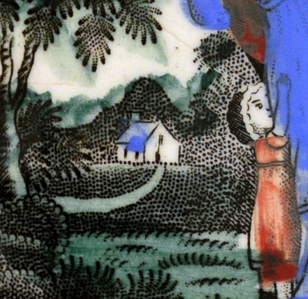
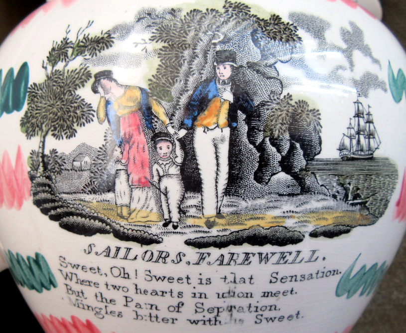
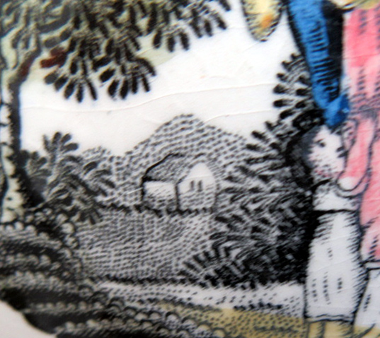
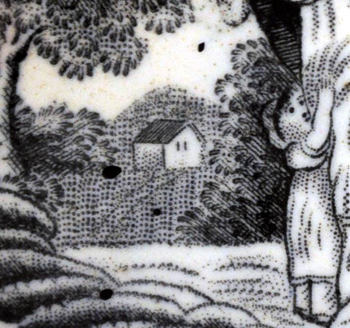
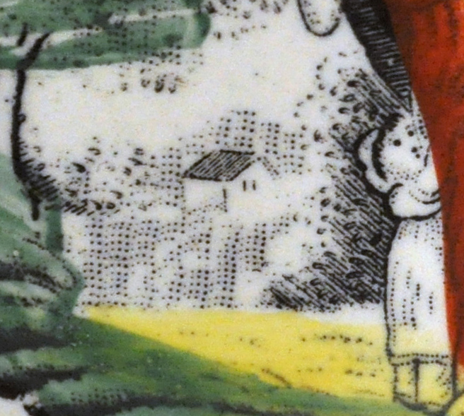
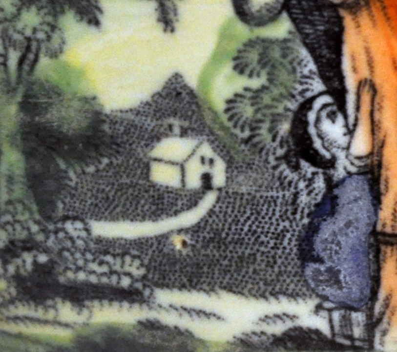
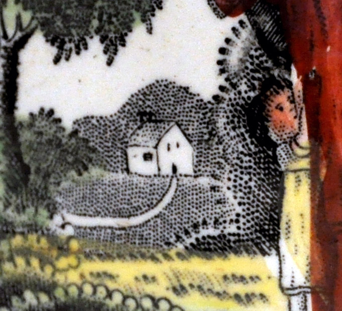
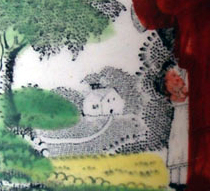
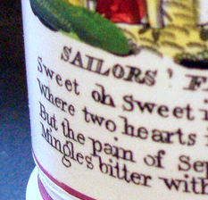
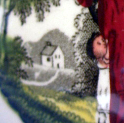
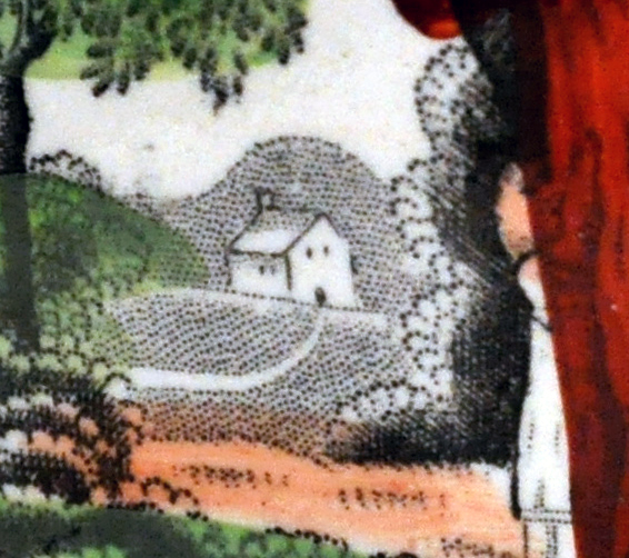
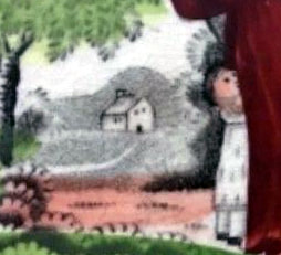
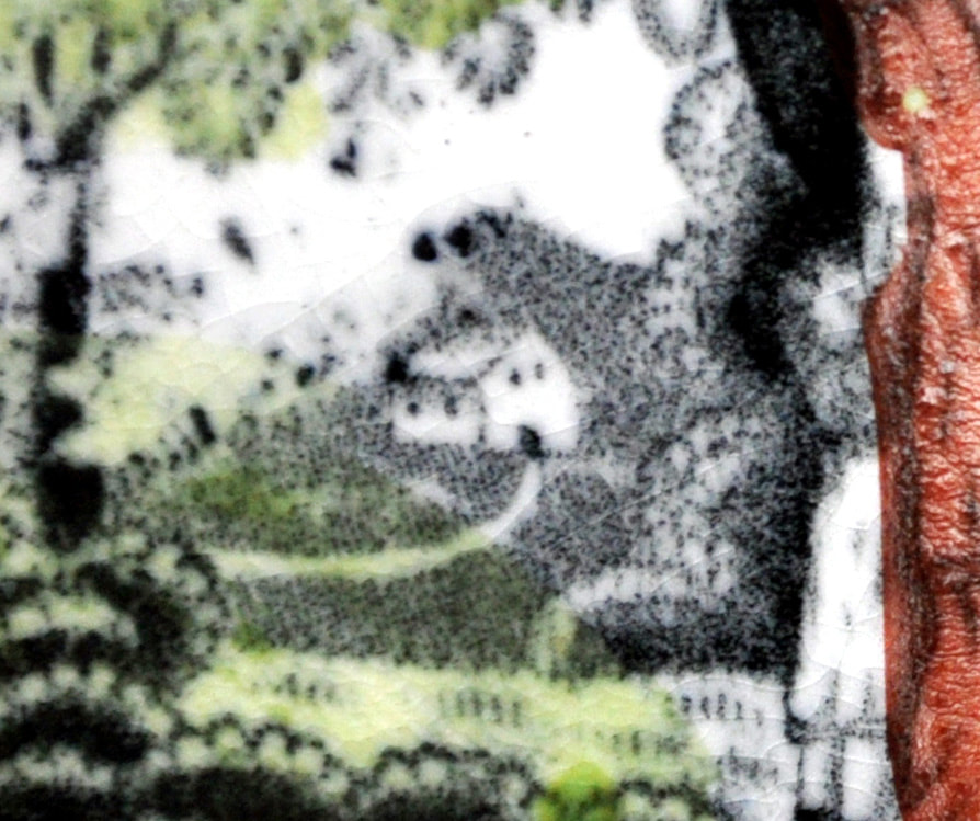
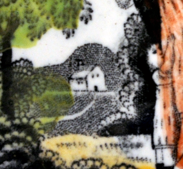
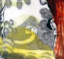
- Cottage in background has two windows on the left, and one-up, one-down on front (top right detail). The hill behind is pointed. The footpath makes a sweeping broad curve.
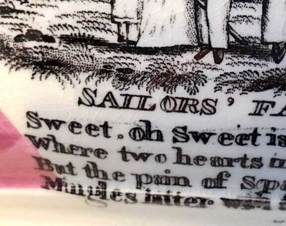
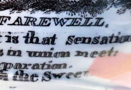
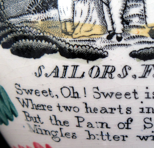
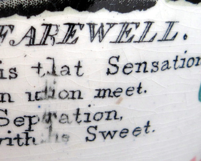
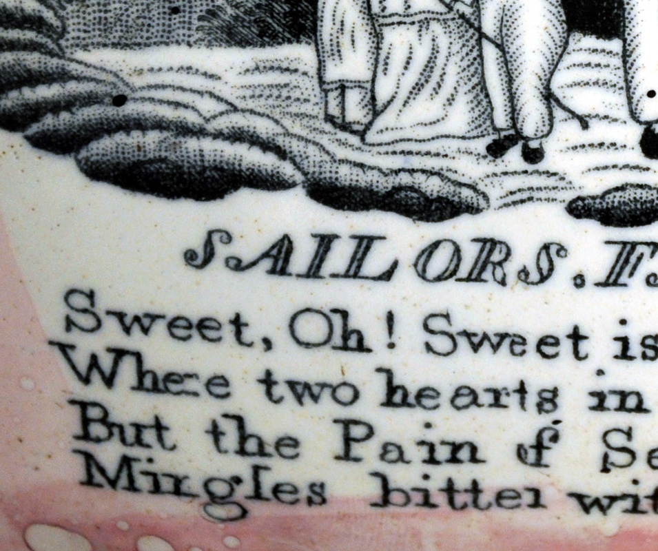
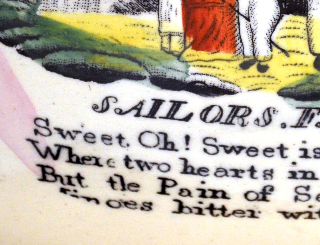
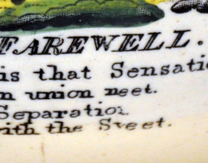
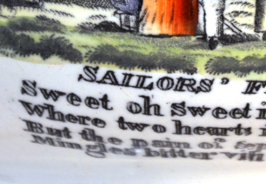
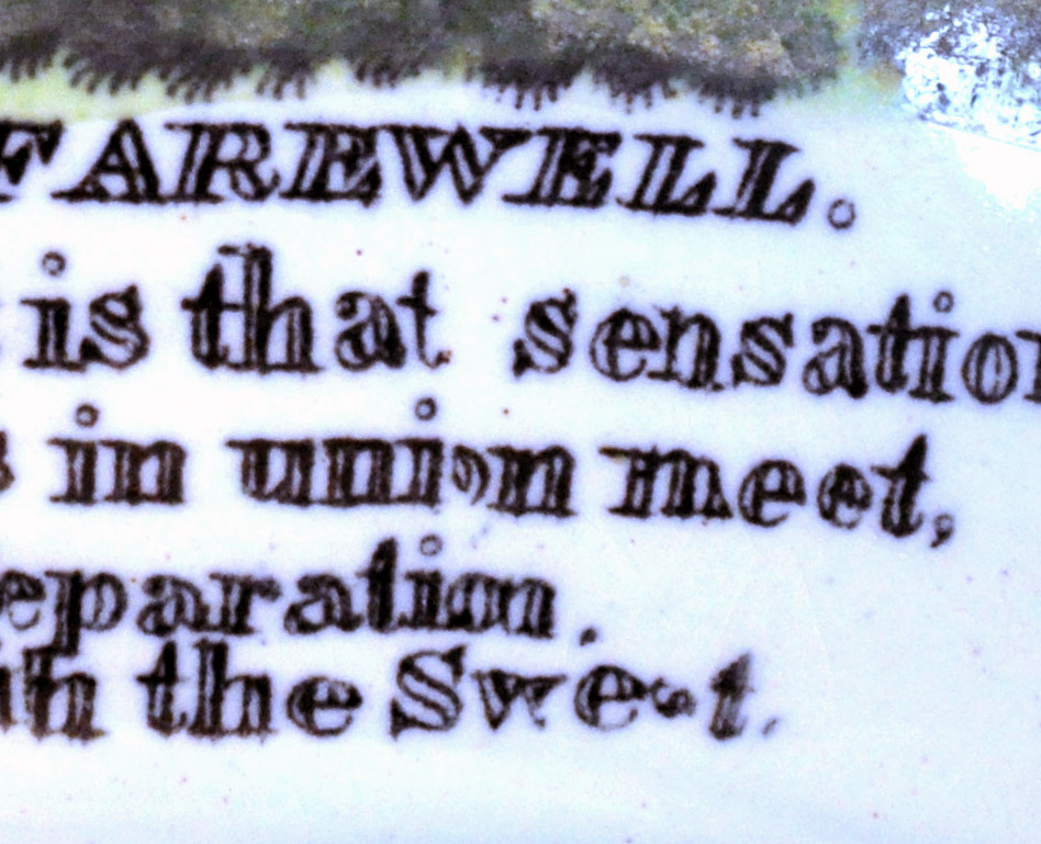
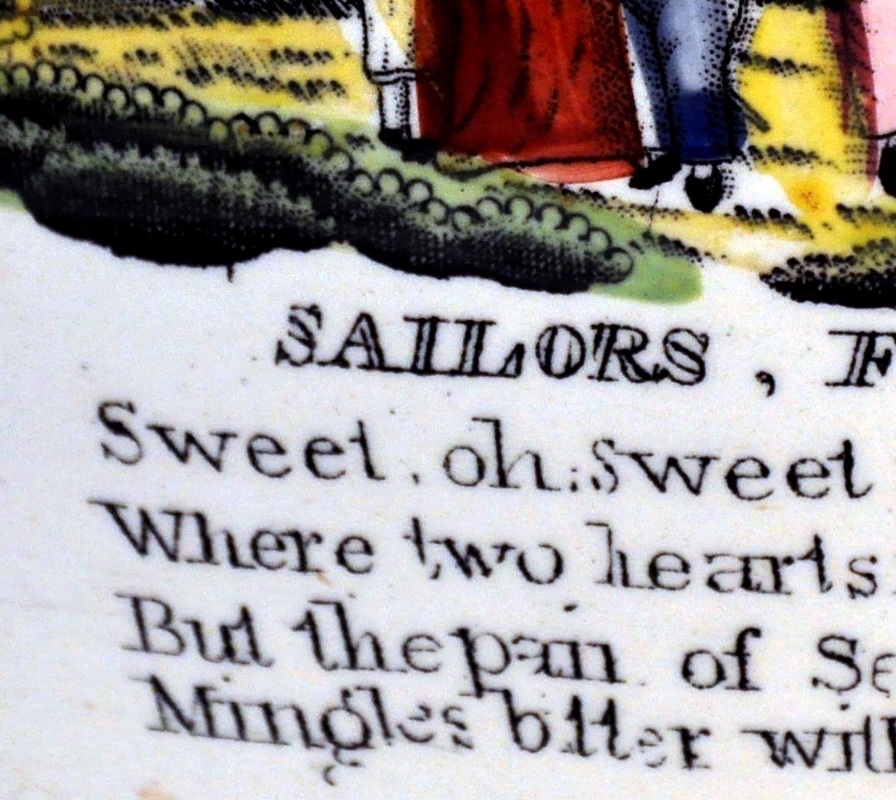
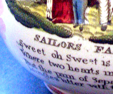
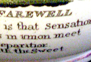
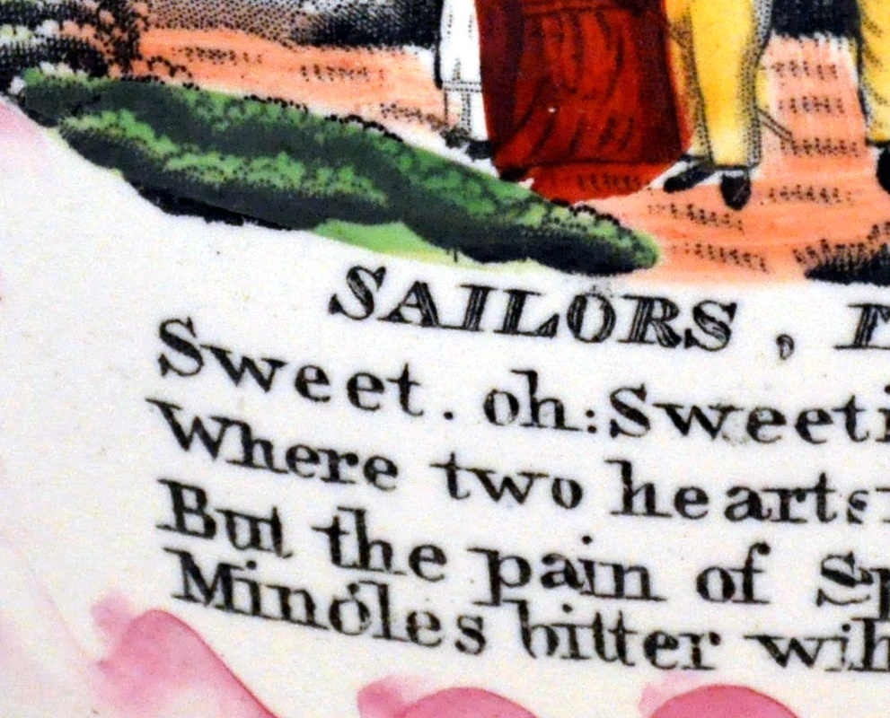
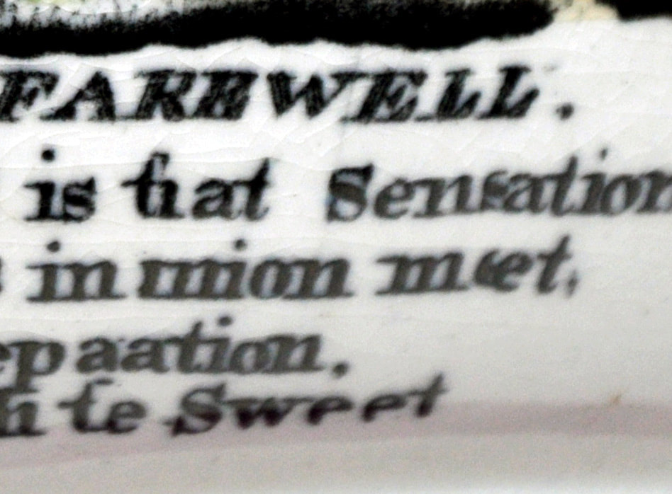
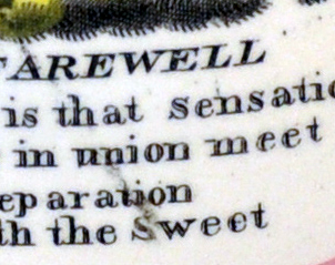
- There is a possessive apostrophe after the word 'sailors' in the title.
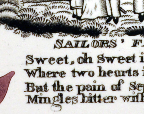
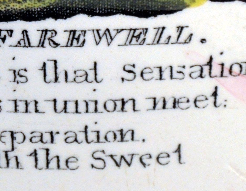
- Comma after the first word 'sweet'.
- The full stops, commas and dots on 'i's are tiny circles.
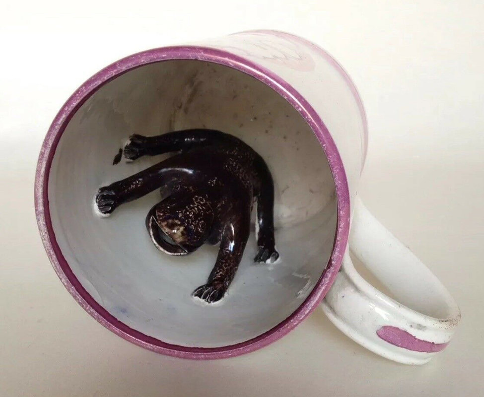
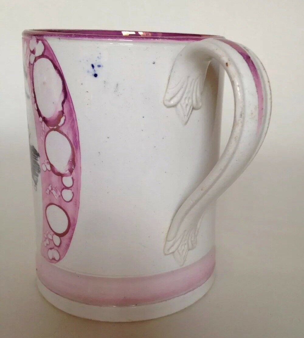
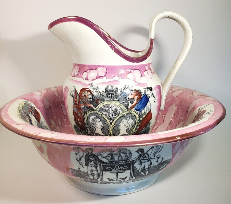
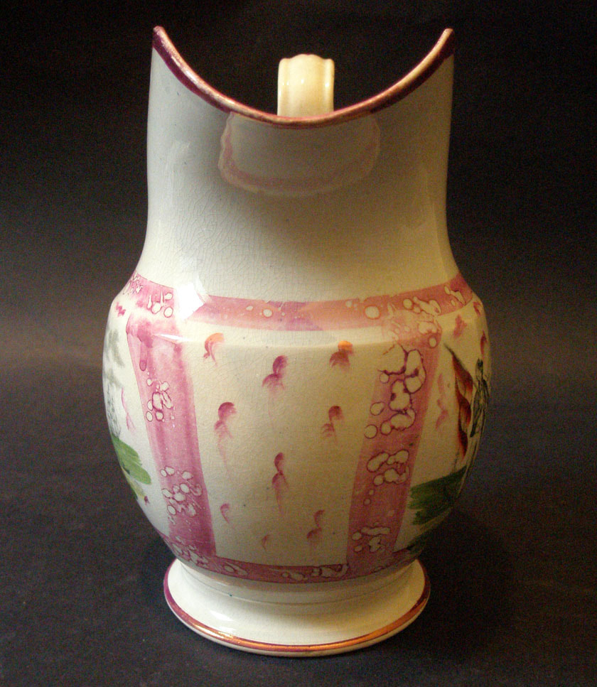
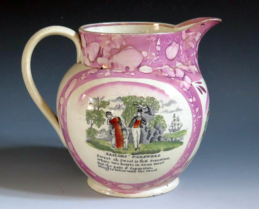
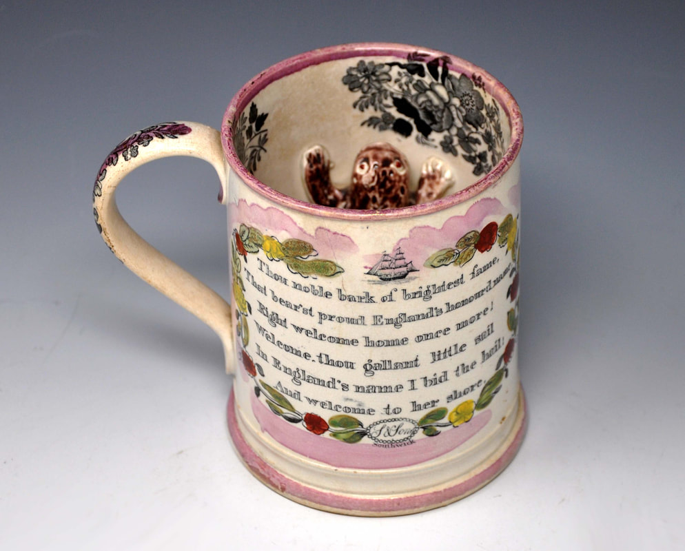
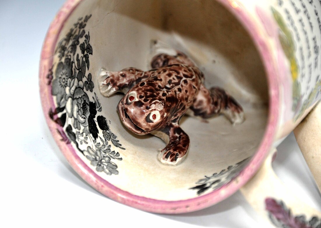
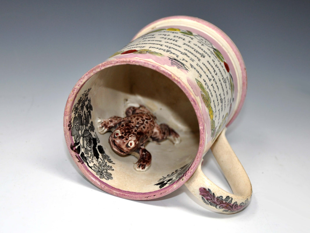
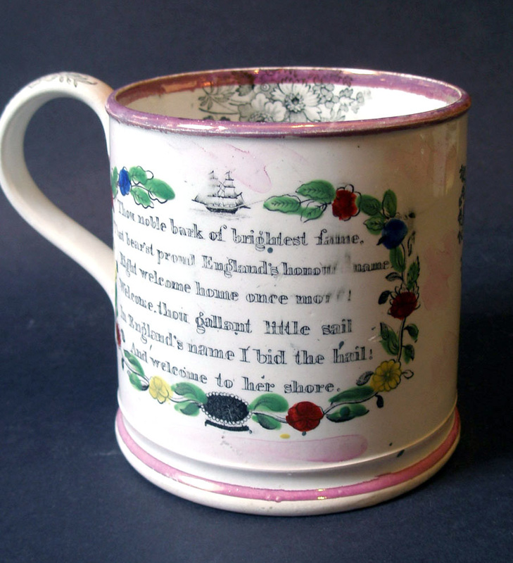
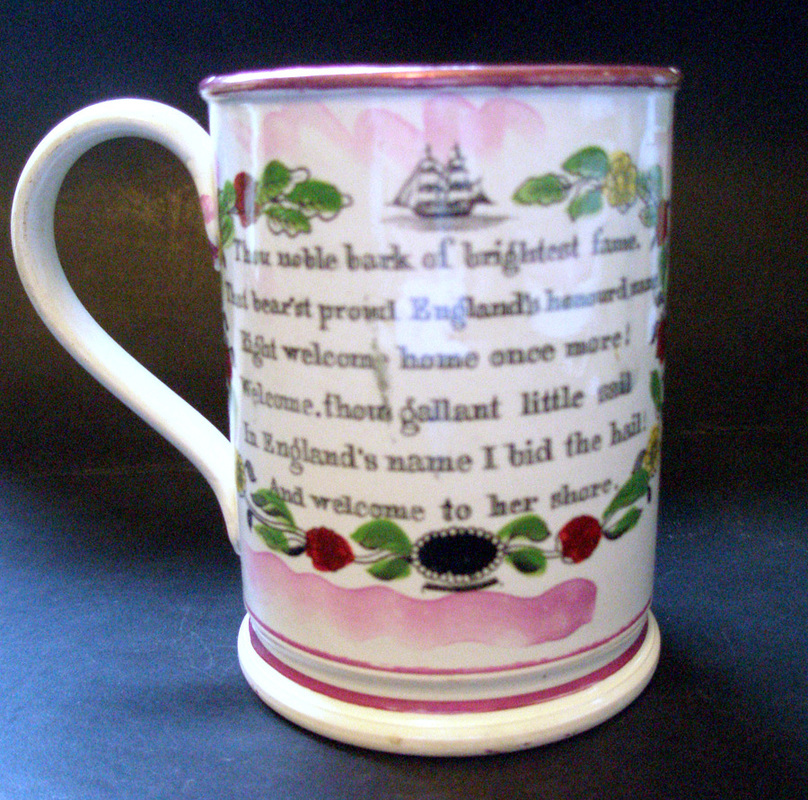
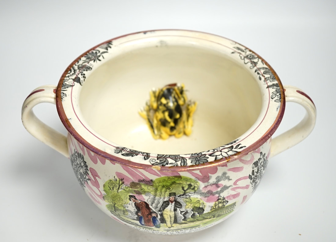
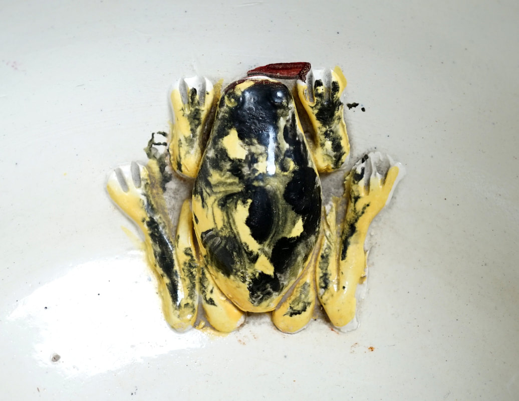
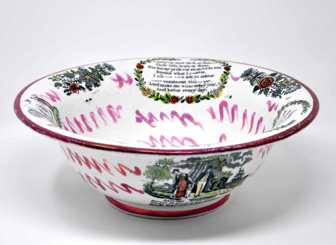
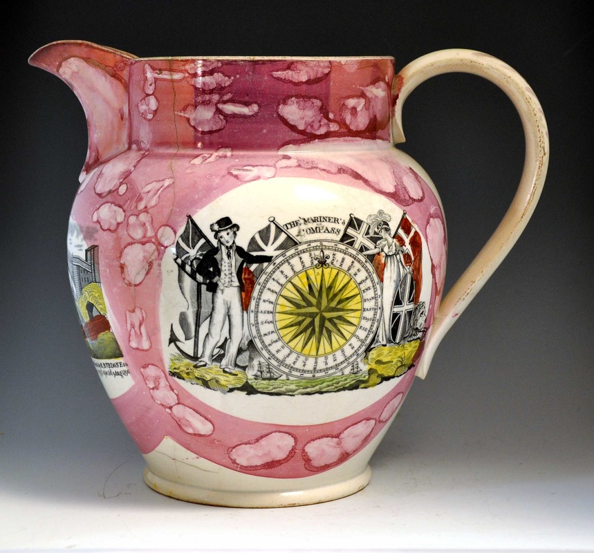
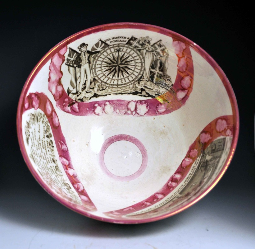
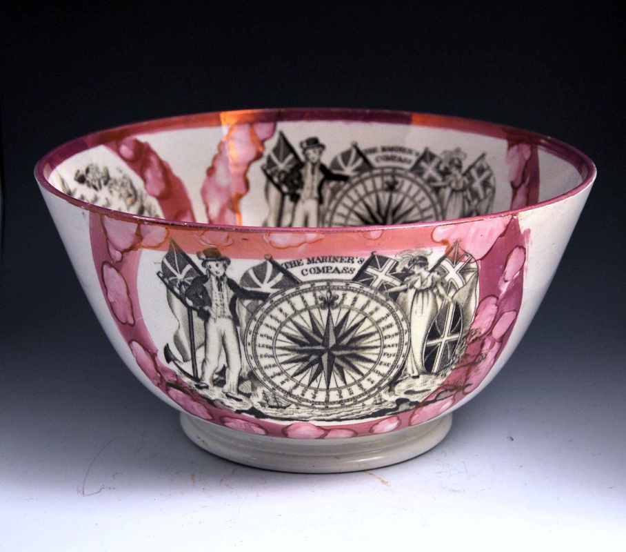
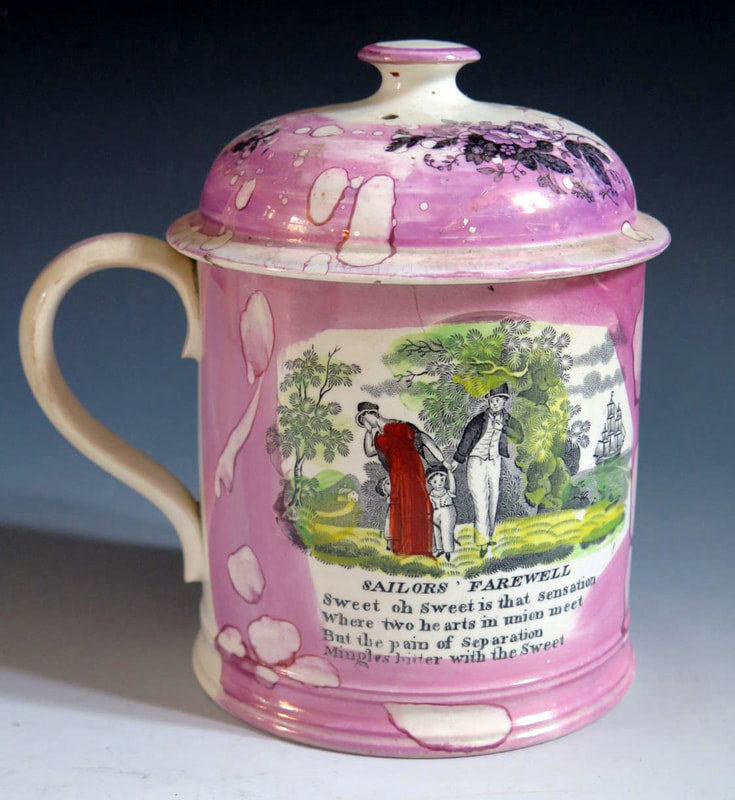
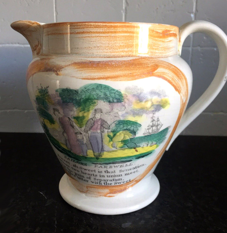
Below, a Garrison frog mug from the 1840–50s with a typical large frog, a wash ewer and bowl of similar period, all unmarked.
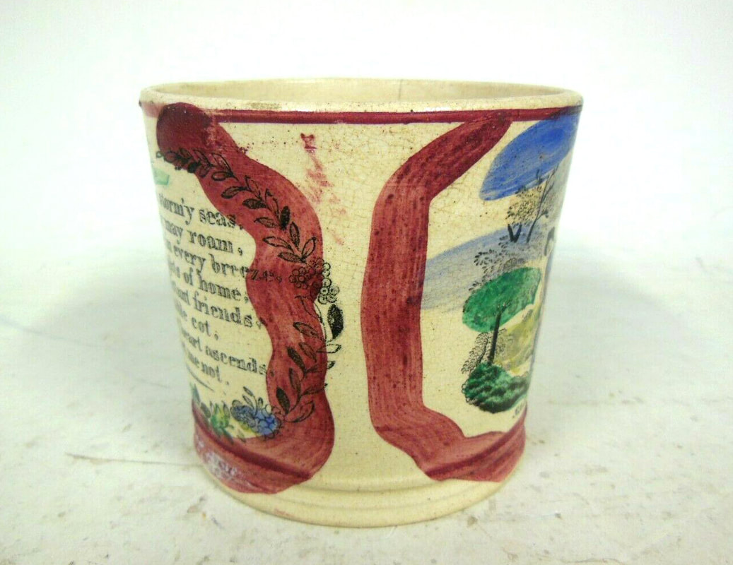
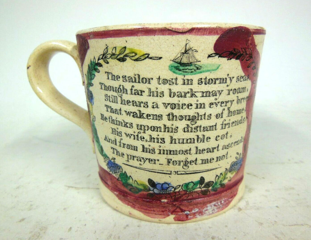
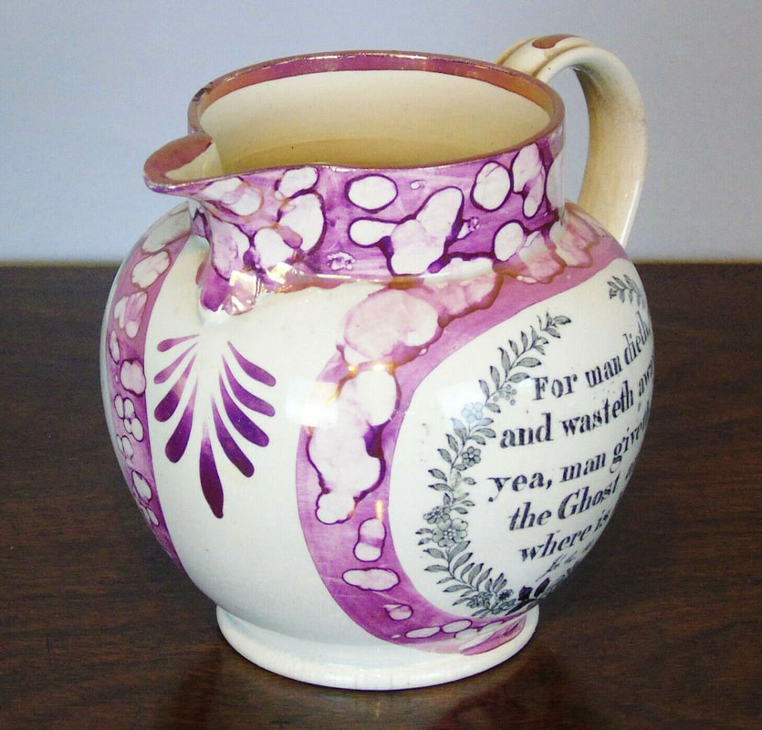
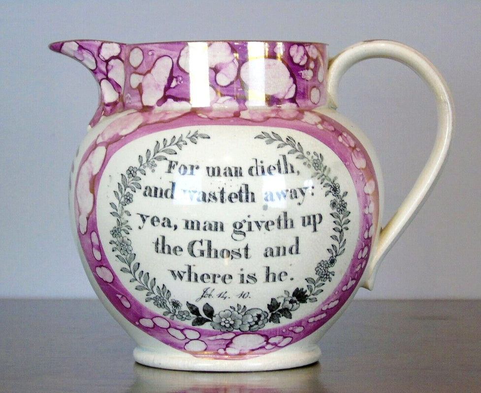
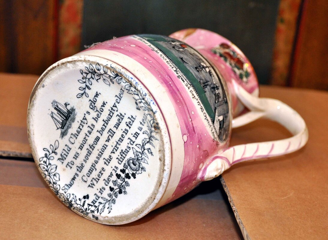
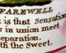
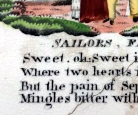
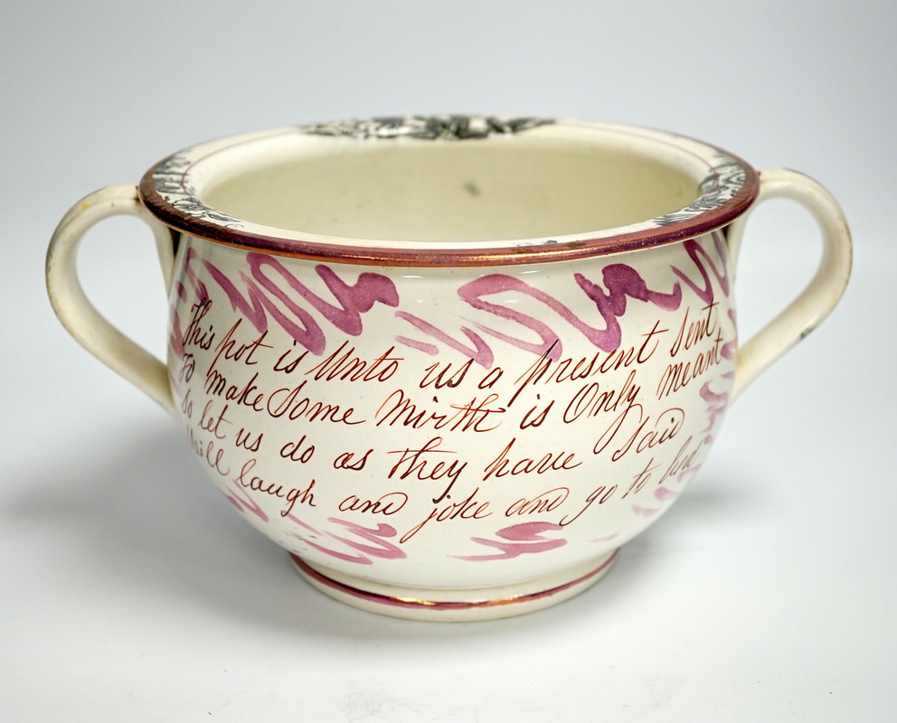
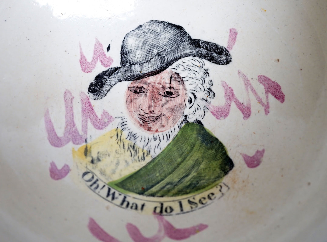
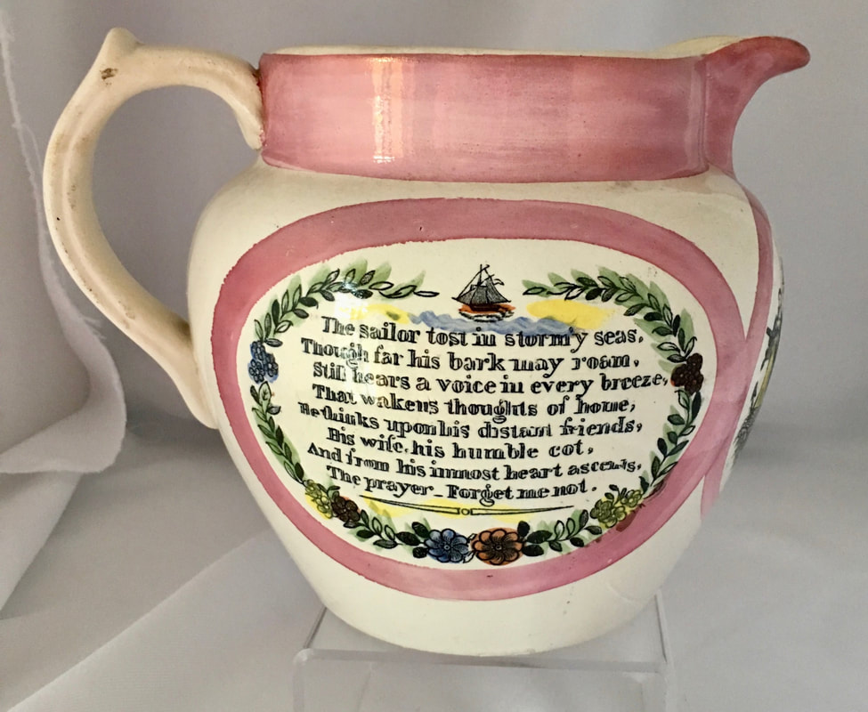
Below a highly unusual pairing of the transfer with a morbid religious verse.
Garrison Pottery 2
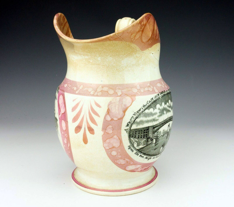
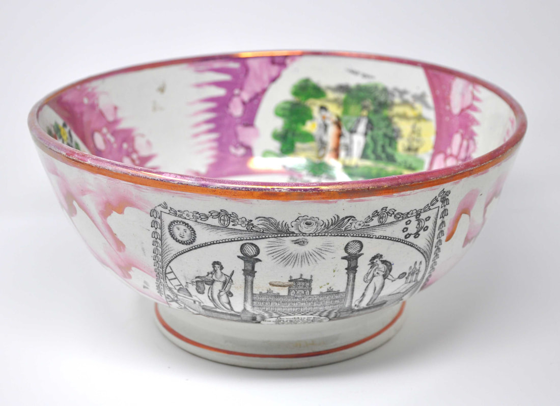
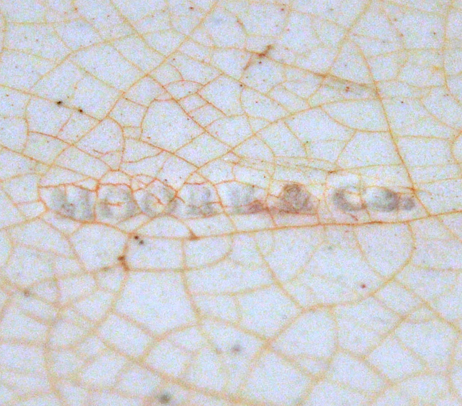
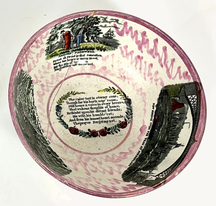
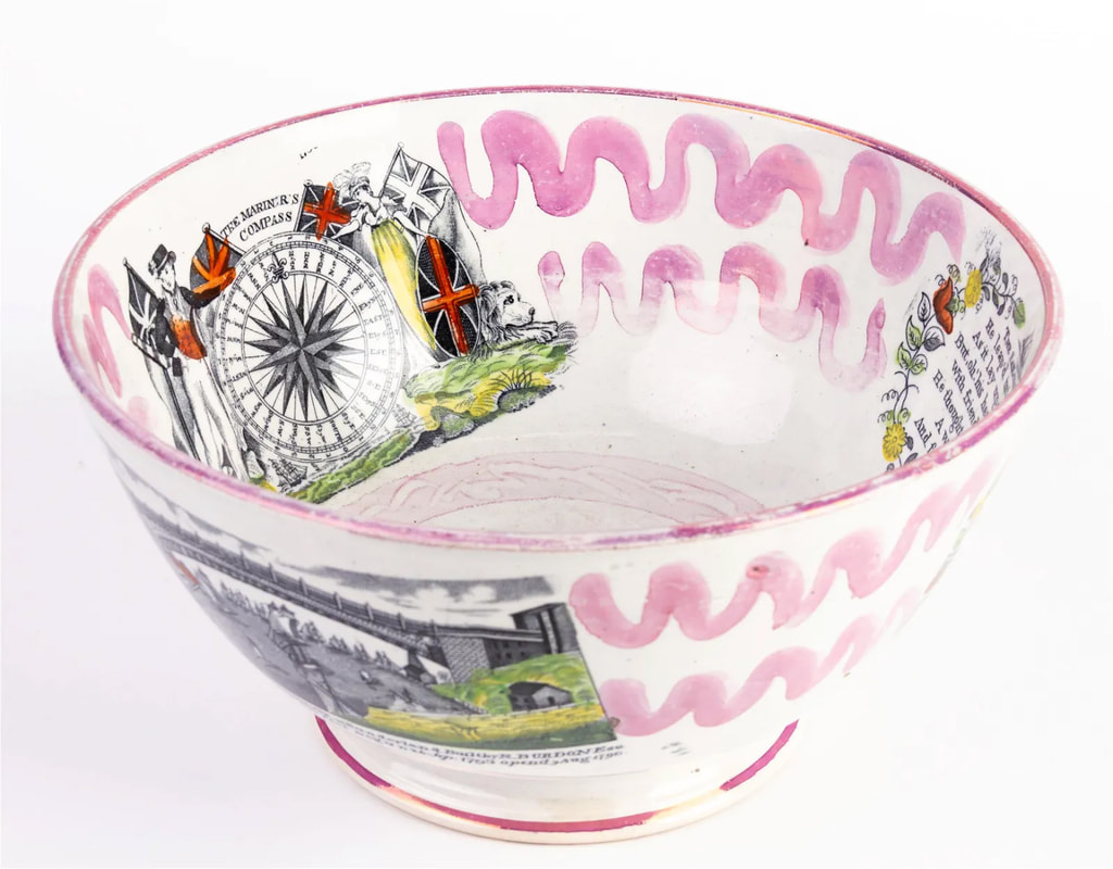
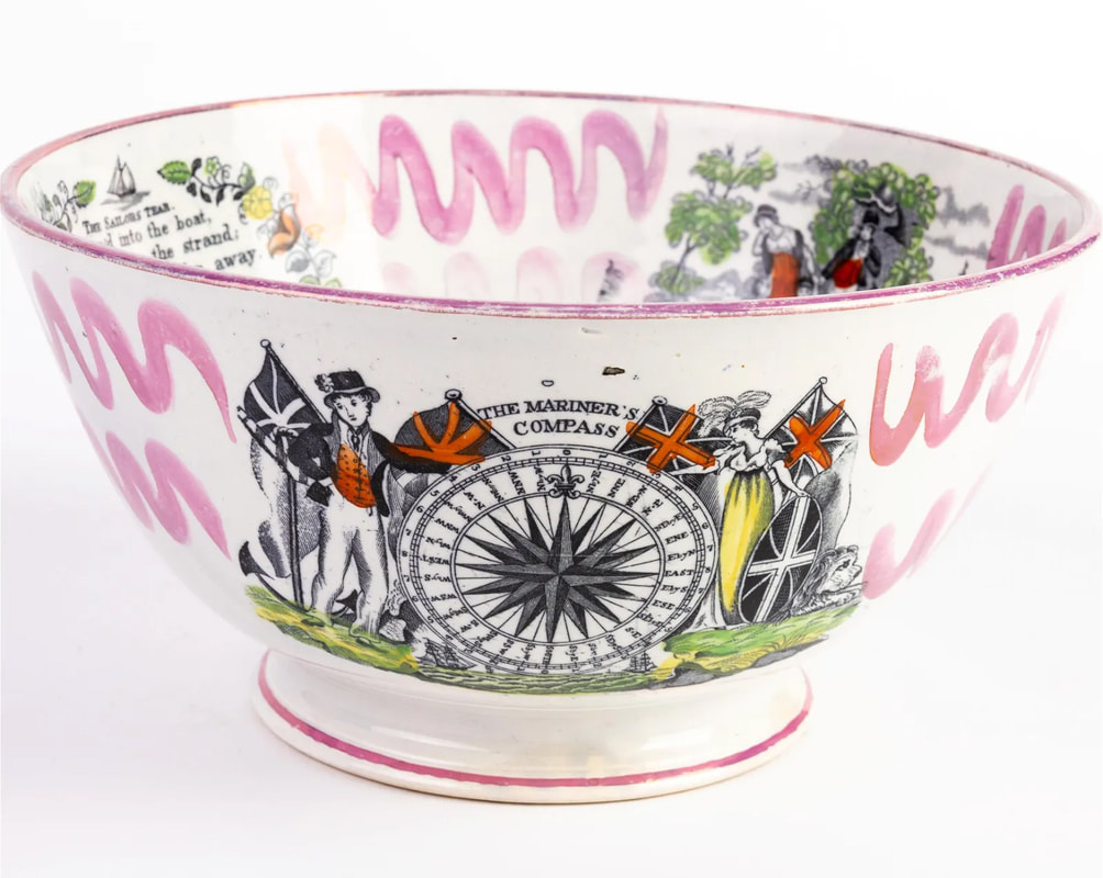
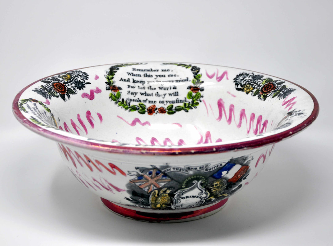
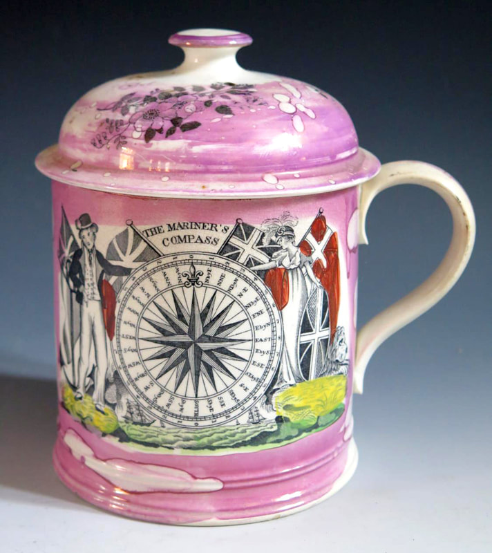
A variation of the transfer that appears on the outside of a washbowl with the 'Dixon Co' impress. The ewer and bowl are decorated with Crimean transfers c1855.
|
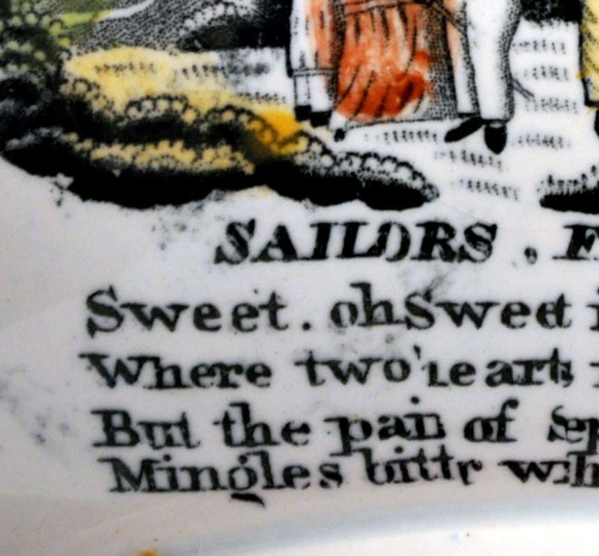
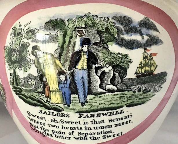
The transfer is very similar to that on the plaque above (right detail), but note the shading of the foliage at the base of the tree. It is hard to see in these photos but the shapes of the clouds are also different in the top right corner of the transfer. Also, there is a full stop, rather than a comma, after the word sweet. |
|

Below a later wash ewer, likely 1860s, with coloured enamels over the transfer.

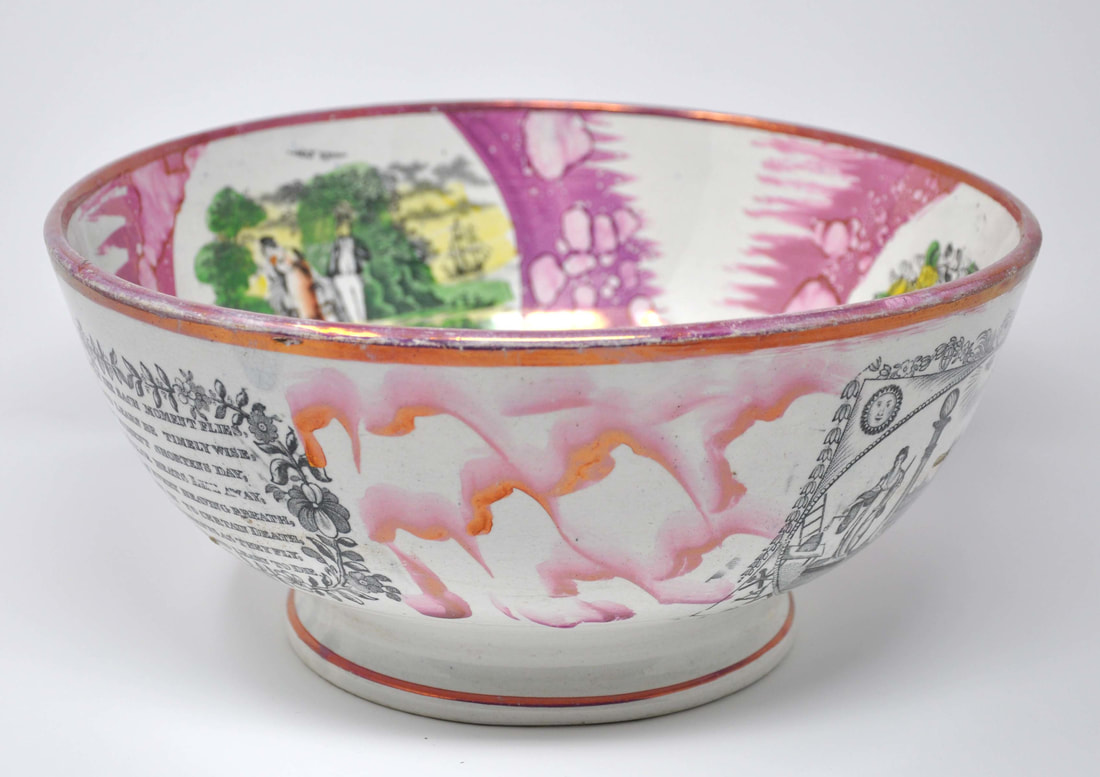
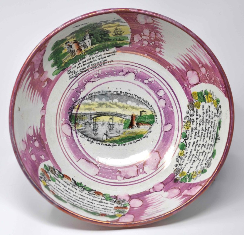
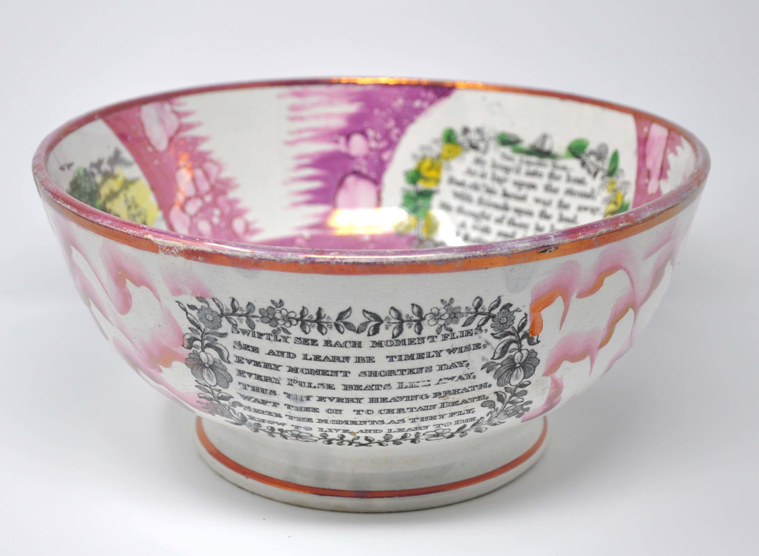
This large punch bowl from the 1860s appears to have the transfer. However, the imprint is heavily degraded and obscured by over enamels, making a comparison difficult.

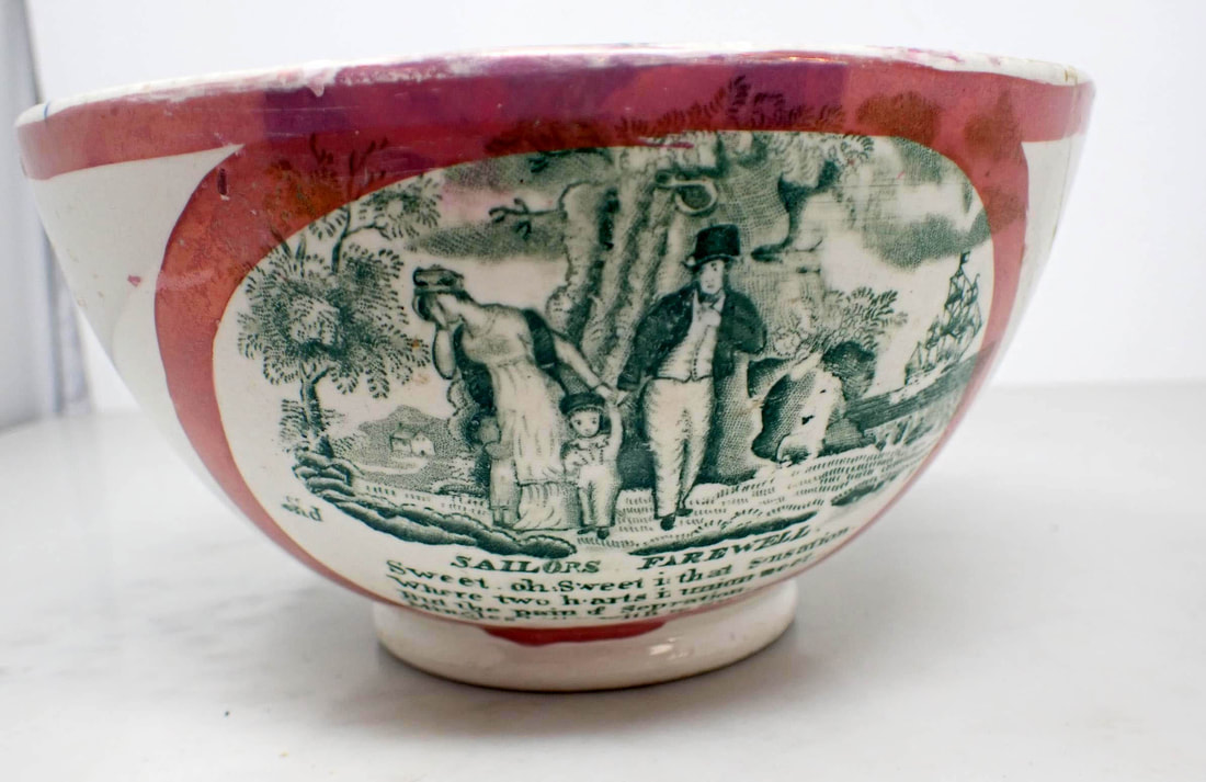
Moore's Pottery 1


Moore's Pottery 2
On the earlier imprints from this transfer plate the front of the cottage is shaded (see top right detail), and the faintly delineated path points horizontally to the left. Note that there is a small scratch under the 'A' in 'Farewell'.
- Cottage in background has no chimney, and no windows on the left, and two windows upstairs on front. The hill behind has a slight point. The footpath is very faintly delineated.
- Full stop after the word 'sailors' in the title, and long curly serif to letter 'A'.
- Comma after the first word 'sweet'.
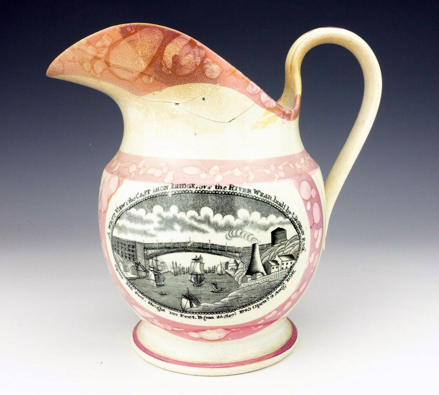
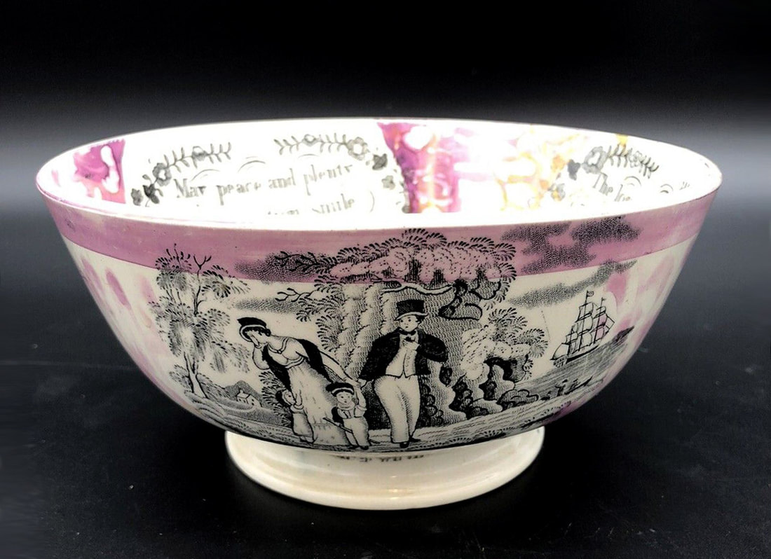
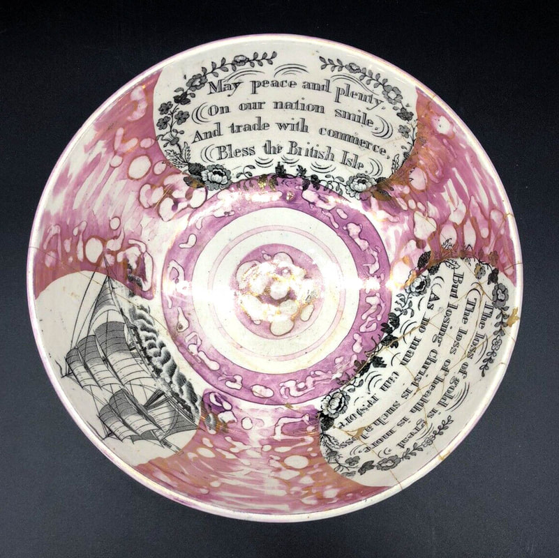
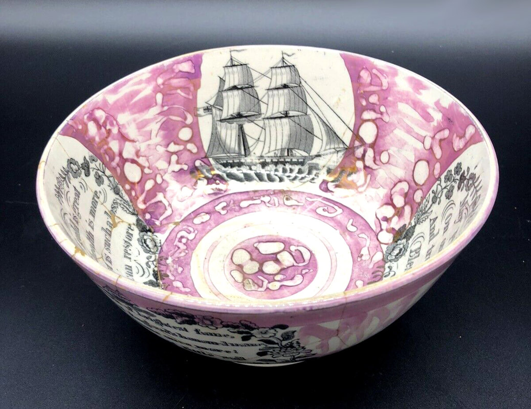
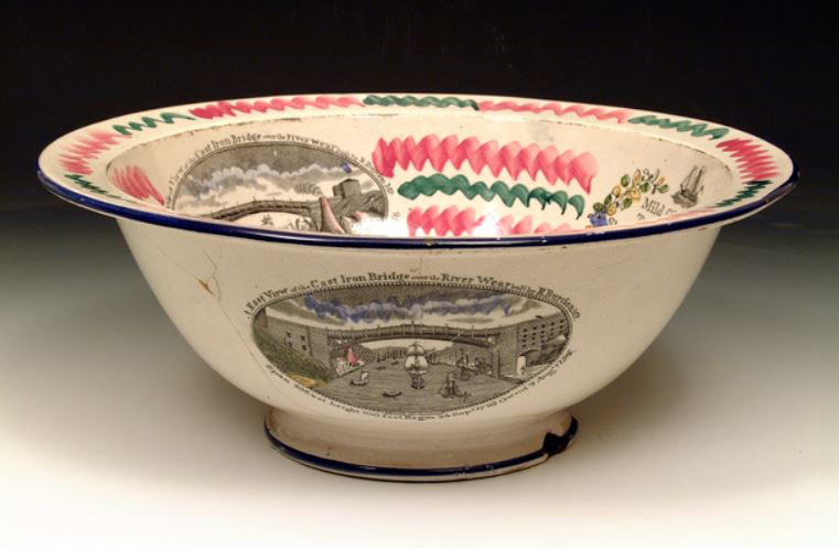
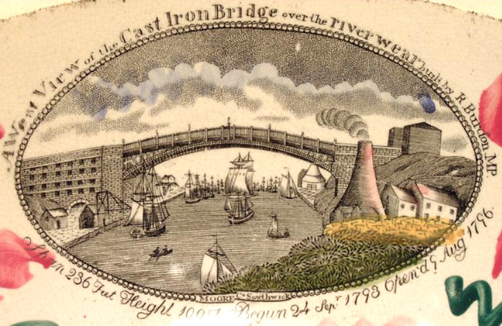
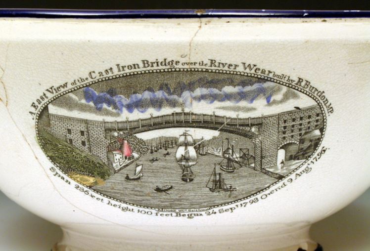
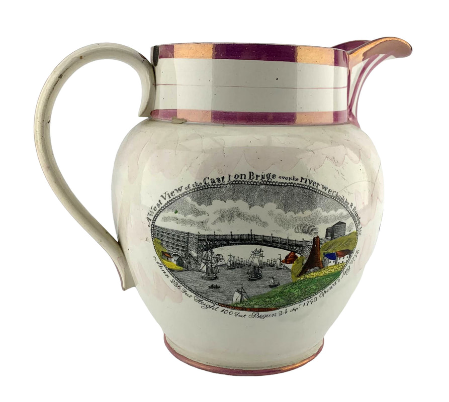
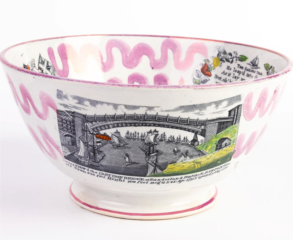
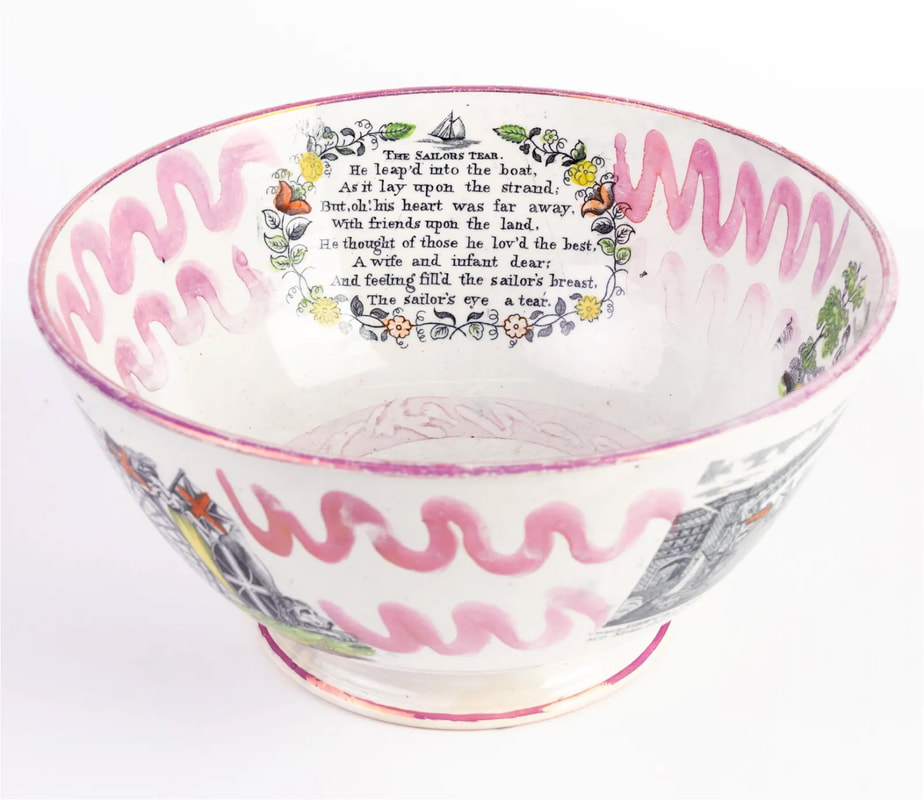
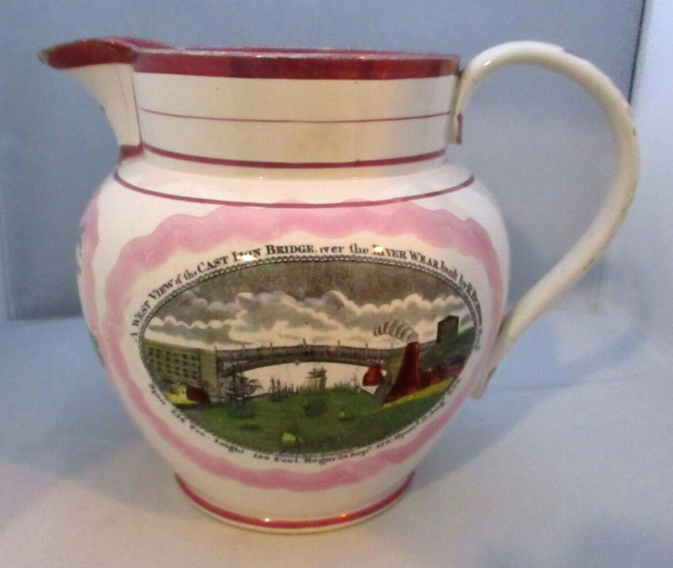
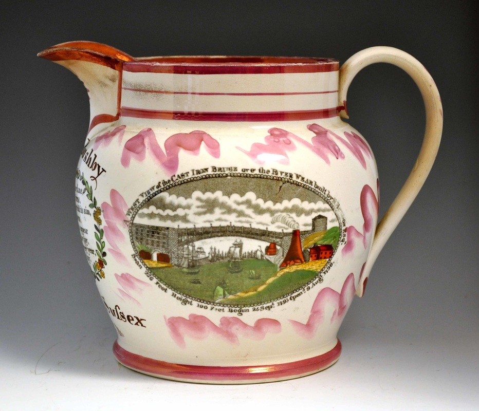
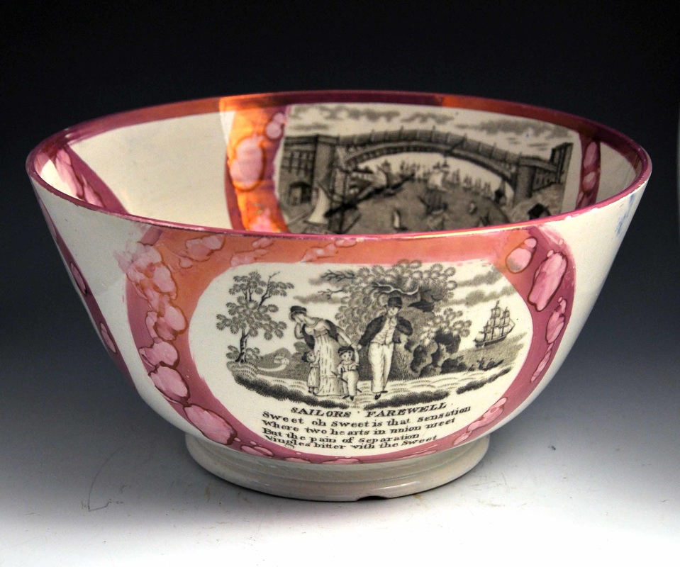
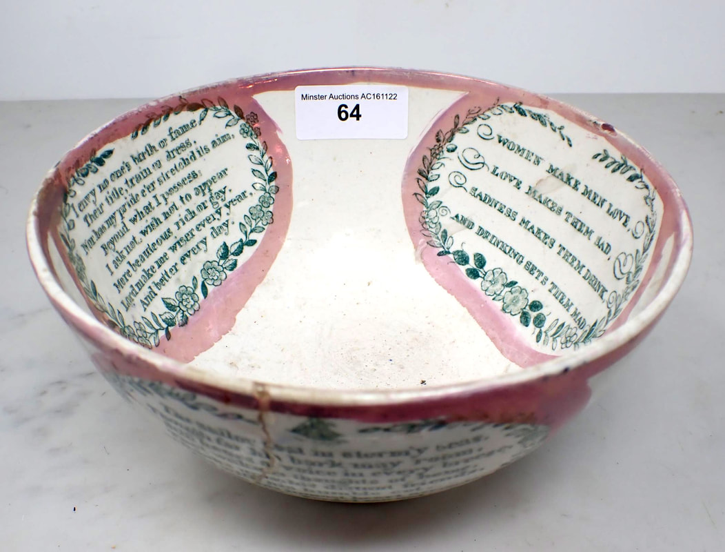
This late 1830s' to early 1840s' bowl, is from the Sunderland Museum & Winter Gardens, Tyne & Wear Archives & Museums collection, and has the transfer both inside and outside. The bridge transfers have printed marks for 'Moore & Co Southwick'.

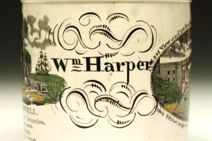
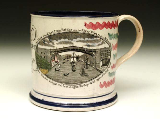
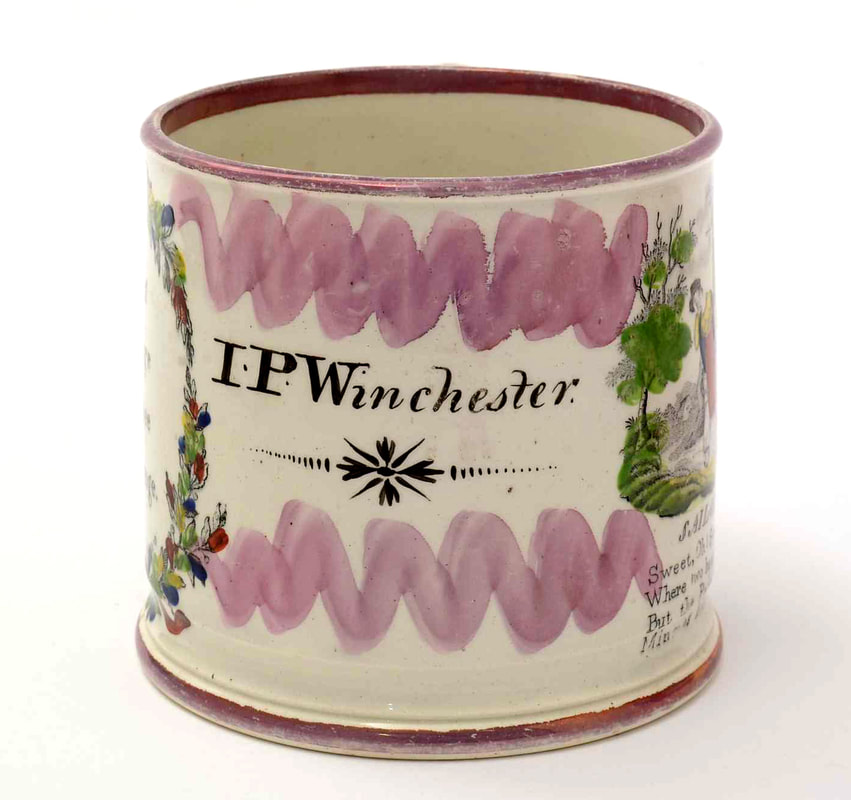
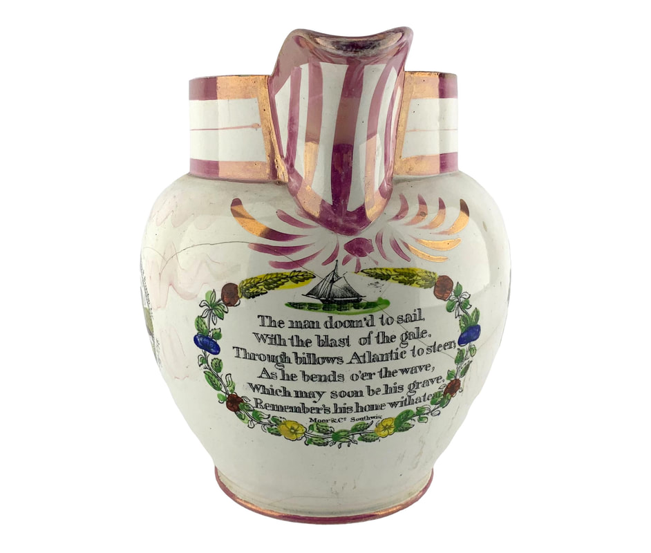
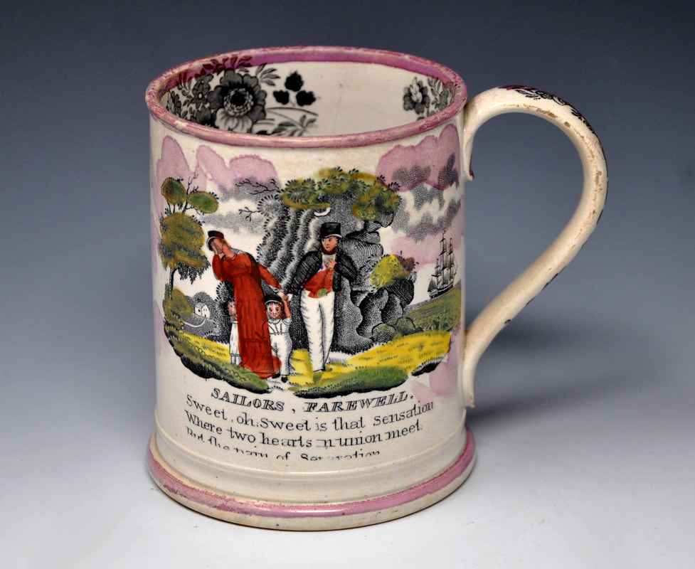
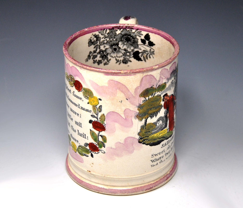
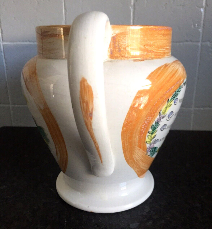
The first mug is also from the Sunderland Museum collection. The second has pink lustre and an inscription likely by the same hand.


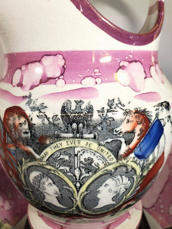
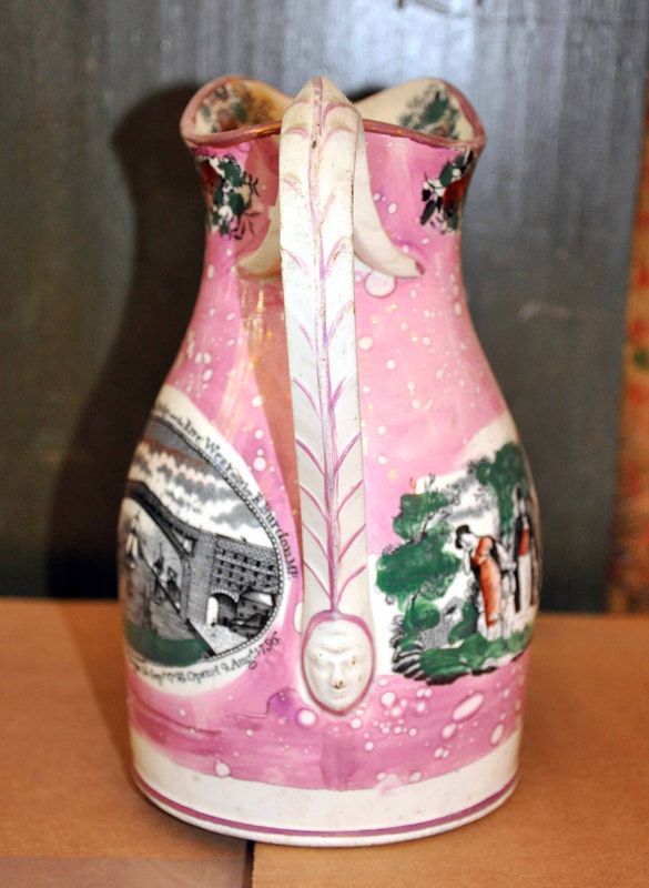
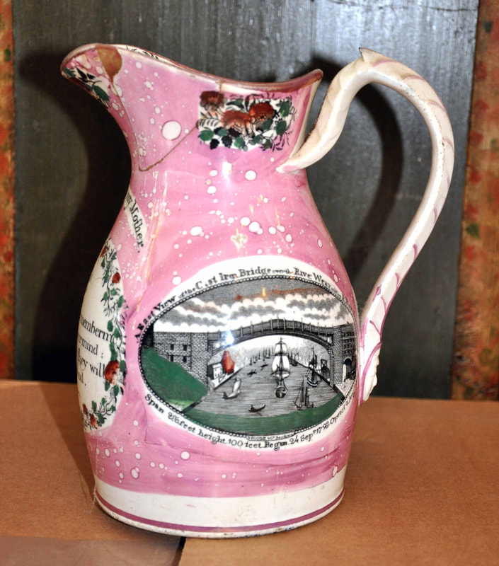
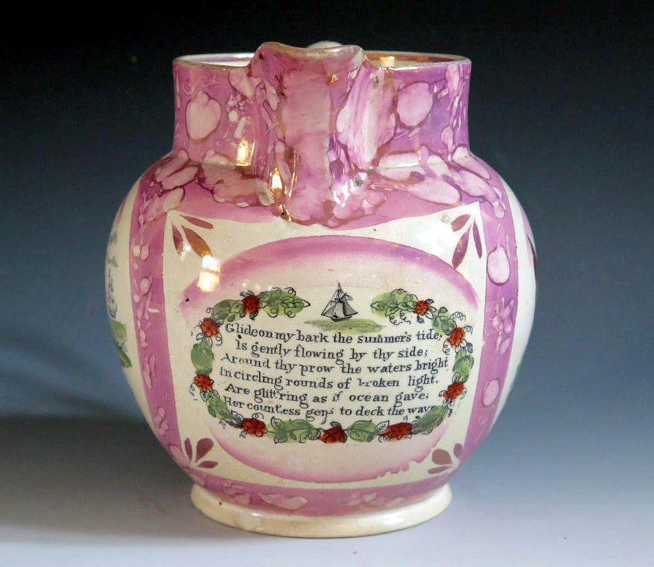
A rare, maybe even unique, jug of unusual shape, with a mask at the foot of a moulded handle, and an inscription 'A present for my Mother'. This is the only recorded jug of this form in pink lustre, and the only known jug with a transfer on the base.

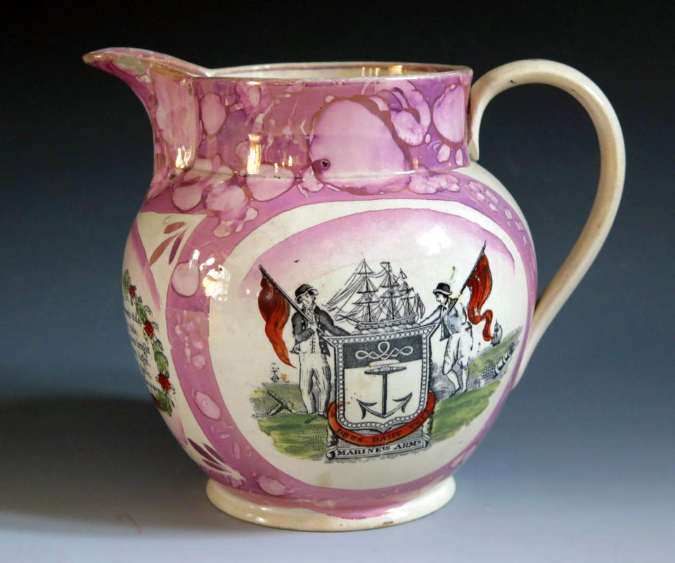
A plate with the transfer and flower decoration around the rim, typical of the 1840s, and beneath it a jug of similar age.
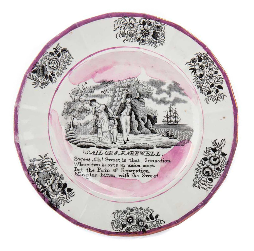
Photo McTears Auctions
The first bowl below, with a printed mark 'The Bottle', was made c1847. Note that, like the plate and jug above, the front of the cottage is no longer shaded (see top right detail). On the bowl, the faintly delineated path now curves downwards.


On the bowl above, the scratch under the letter 'A' is still just visible. By the 1850s, however, the scratch is gone; see the bowl below with the Crimea transfer, c1855. By this time, the transfer plate appears to have worn considerably.
Below is another smaller Moore-impressed bowl, also from the mid 1850s.


Moore's Pottery 3
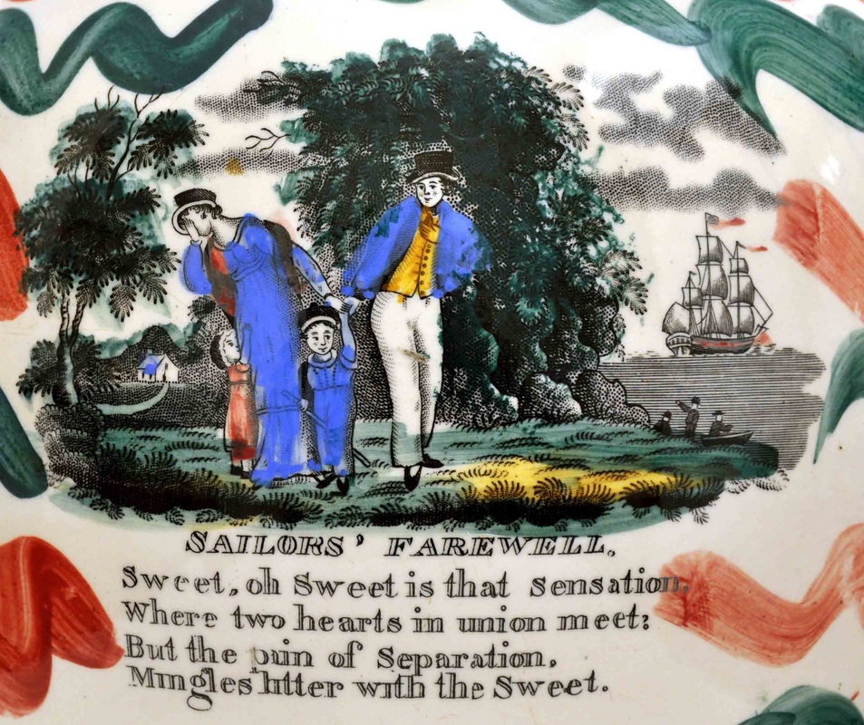
- Cottage in background has no windows on the left, and two-up, one-down on front. The hill behind is pointed. The footpath makes a sweeping broad curve.
- Possessive apostrophe after the word 'sailors' in the title.
- No comma after the first word 'sweet'.
- The full stop after 'farewell' and dots on 'i's are tiny circles.


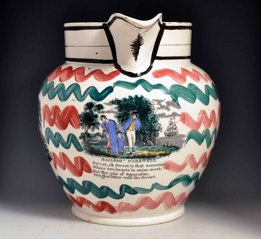
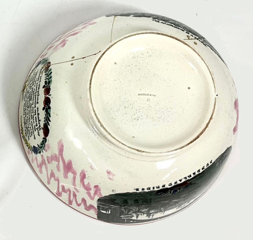
Above, an exceptionally well-decorated jug with the same transfer. Below a large bowl, impressed 'Moore & Co' over the number '8'.
Attributed to Newbottle High Pottery
This jug is attributed to Newbottle on the basis of the distinctive script of the verse transfer.
- The foot of the letter 'h' in the word 'oh' extends from one side to the other.
- Cottage in background has two windows on the left, and 1 upstairs window on the front (hard to see in this imprint). The hill behind has a flattened point.
- Possessive apostrophe after the word 'sailors' in the title.
- Comma after the word 'sailors' in the title.
- No comma after the first word 'sweet'.
A bowl with similar red enamelling over the transfer, and bridge 29 firmly attributable to Newbottle.

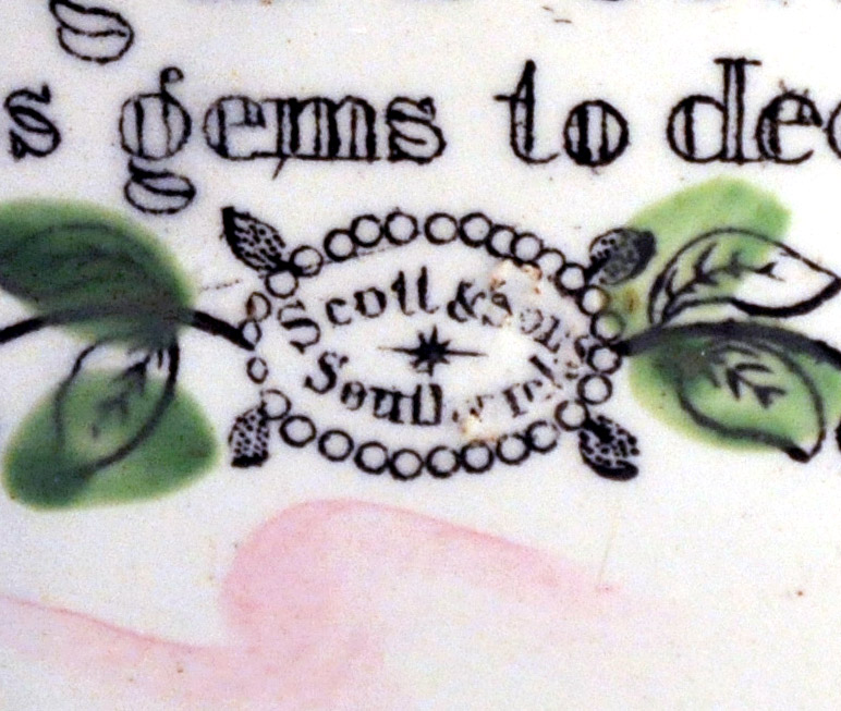
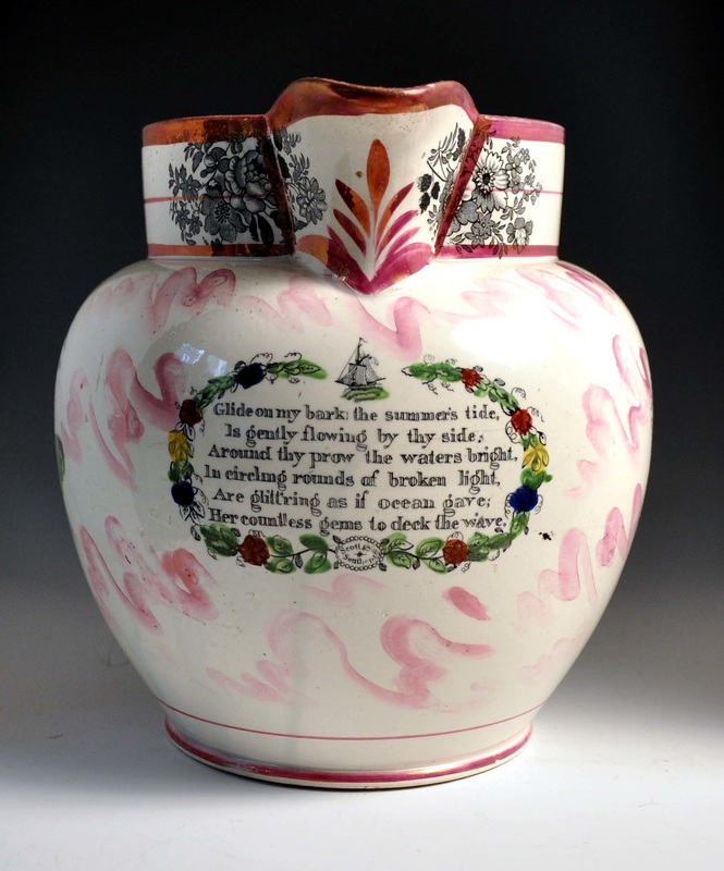
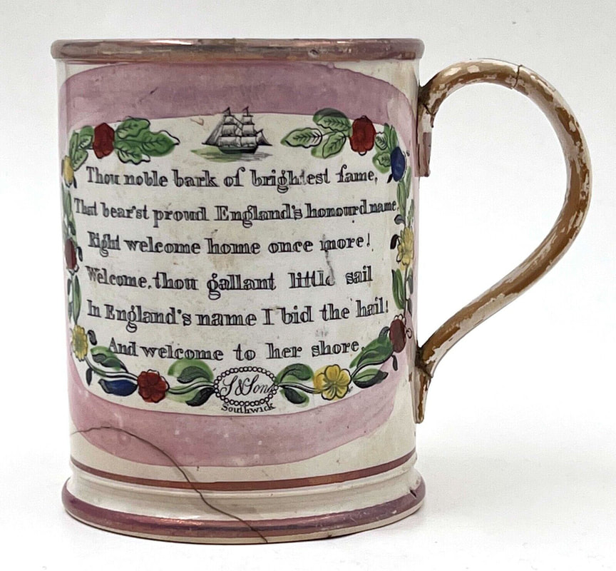
A Scott and Sons, Southwick
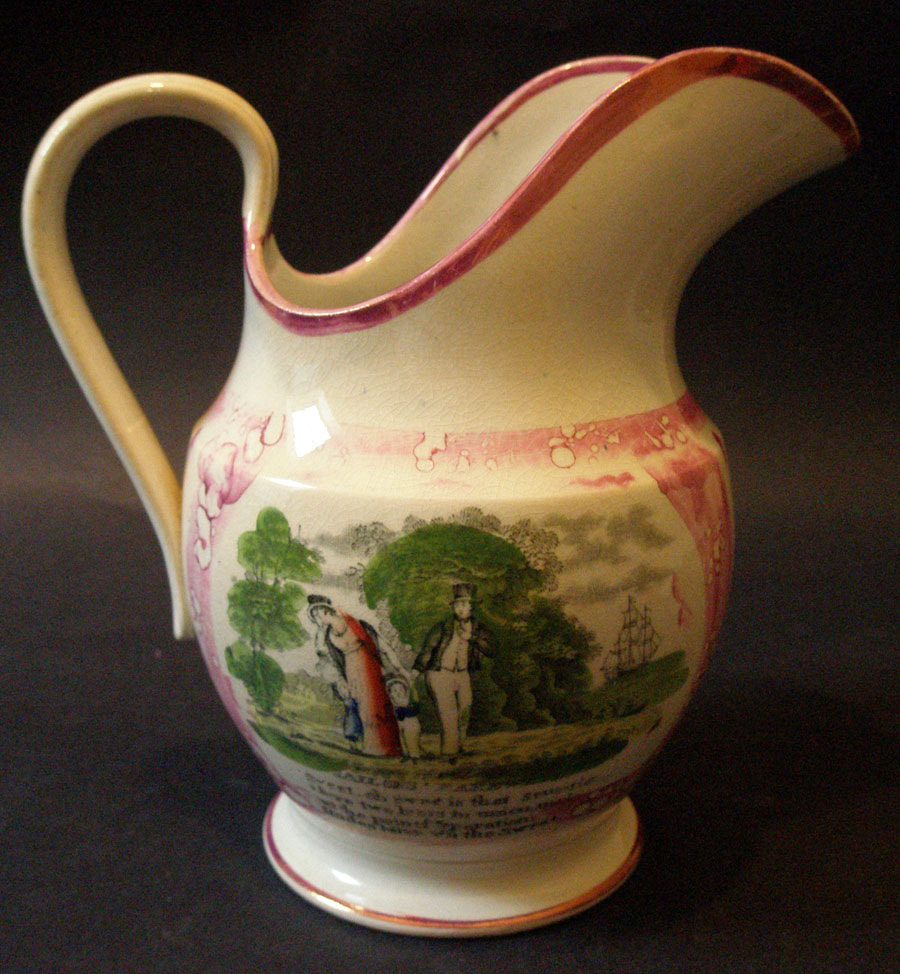
Baker lists this partnership as running from 1829–1841. N.B. the printed mark (below right) is from the 'Glide on my bark' transfer under the spout of the jug.
- Cottage in background has one window on the left, and two-up, one-down on front. The hill behind is round.
- Comma after the word 'sailors' in the title.
- Full stop after the word 'sweet'.
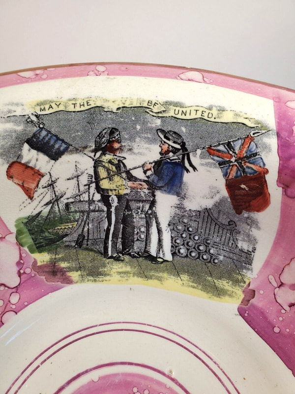
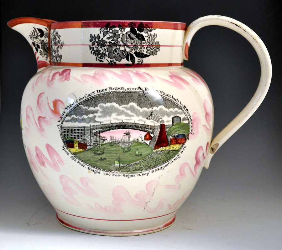
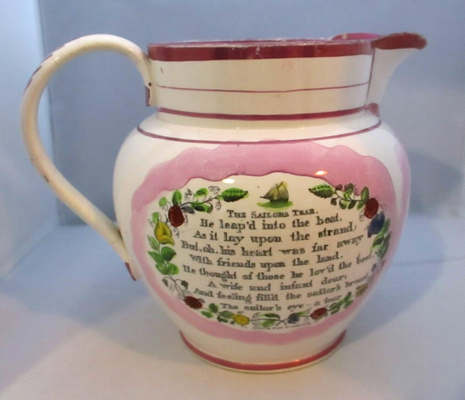
The second jug below has the bridge and sailor's tear transfers with the printed mark 'Scott & Sons Southwick' beneath. The lustre decoration of the collar is typical of Scott's and was used into the 1860s.

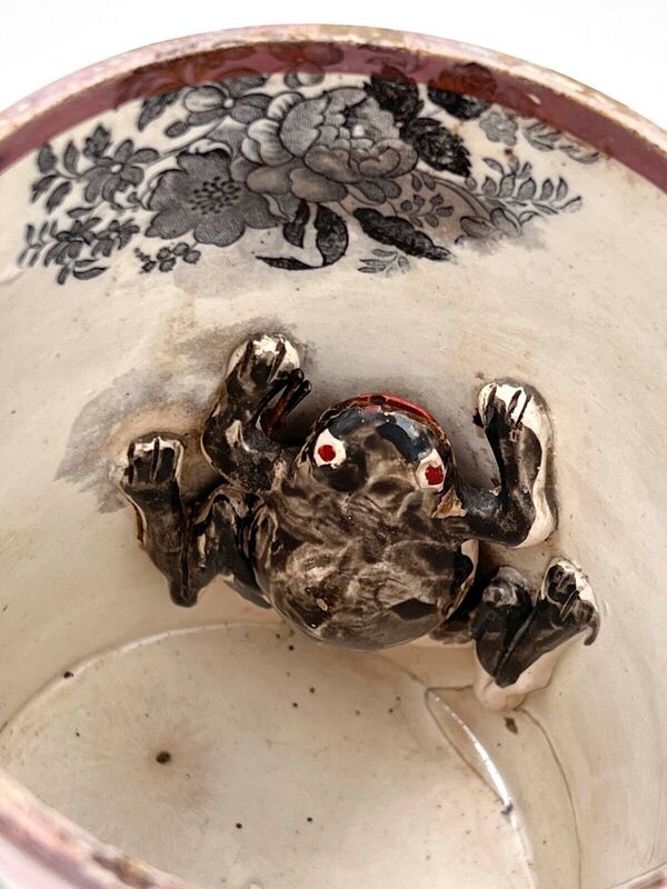
A frog mug with a verse transfer marked 'S & Sons Southwick'. The frog is similar to the red-eyed frogs found on early Dixon items.

A mug with the same transfers and more typical frog.

The transfer as it appears on an eel pot, but with the verse trimmed off to fit. The flower decoration on the lid is typical of Scott's Pottery, and note the similarity of enamelling to the items above and below.
The mug below has a faded imprint from the same copper plate. The factory mark has been blacked out on the verse transfer on the other side of the mug. That was likely done when the partnership changed to Scott Brothers and Co in 1841.

Scott Brothers and Co, plate 1
This mug is attributed to the 1841–1872 partnership on the basis that the noble bark transfer on the reverse has a blacked out makers mark. The original mark read S & Sons, Southwick, and was likely concealed when the pottery was rebranded as Scott Brothers and Co in 1841.
- Cottage in background has one window on the left, and two-up, one-down on front. The hill behind is round.
- Apostrophe after the word 'sailors' in the title, but no full stop after 'farewell'.
- No comma or full stop after the first word 'sweet'.


Scott Brothers and Co, plate 2
The jug below has a slightly smaller variation of the above transfer. The most obvious differences being that the full stops and dots on the 'i's are larger and there is a comma after the word 'sailors' rather than an apostrophe.

- Cottage in background has one window on the left, and two-up, one-down on front. The hill behind is round.
- Comma after the word 'sailors' in the title, but no full stop after 'farewell'.
- No comma or full stop after the first word 'sweet'.

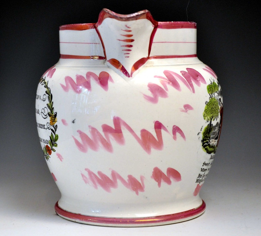
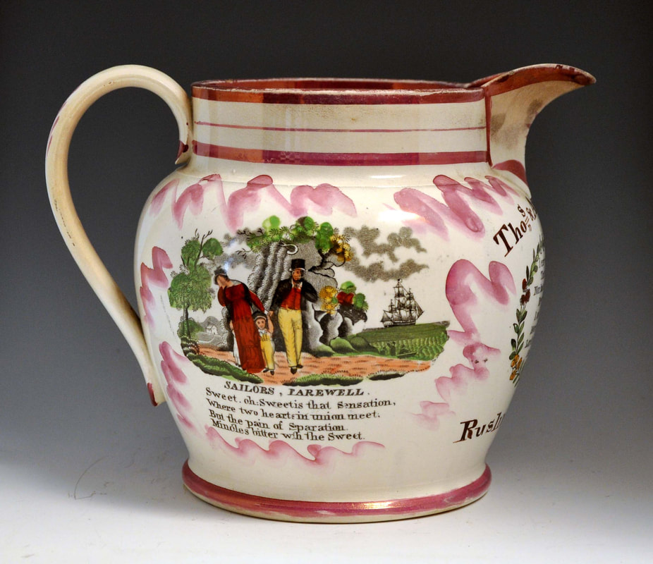
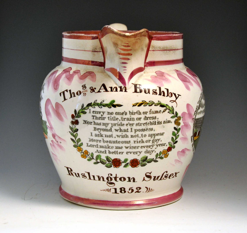
Scott Brothers and Co, plate 3
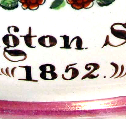
The transfer below belongs to the Scott Brothers and Co partnership, which Baker says ran from 1841–1872. The marriage jug below is dated 1852.

- Cottage in background has two windows on the left, and two-up, one-down on front. The hill behind is round.
- Comma after the word 'sailors' in the title.
- Full stop after the word 'sweet'.
The bowl below has the same transfer, but it has crumpled during application around the tapering curved surface of the bowl.


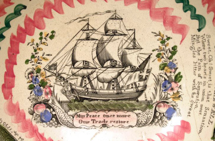
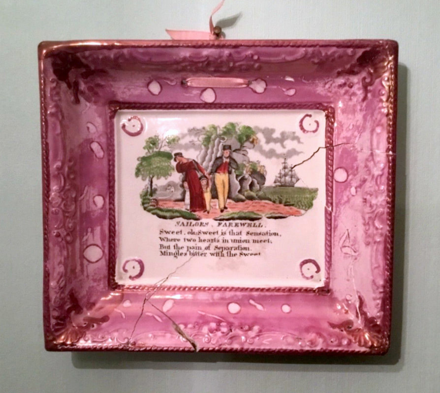
A very similar version of this transfer appears on Scott-attributed plaques. The details are almost identical, except for the foliage in the top right detail.

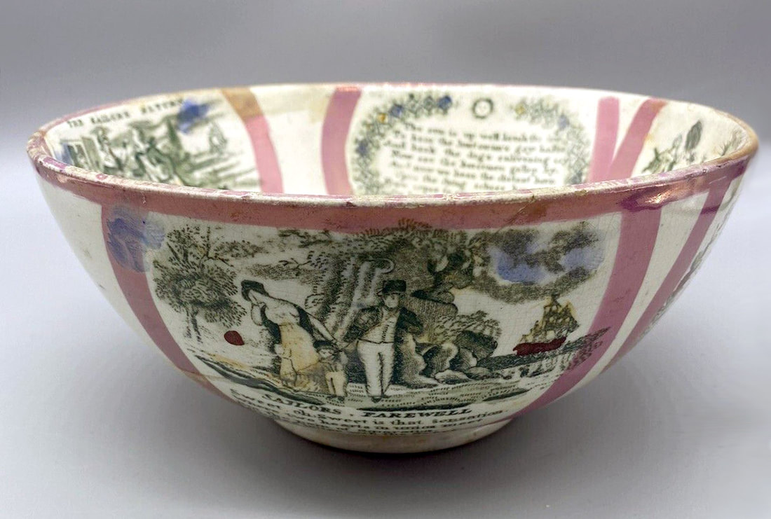
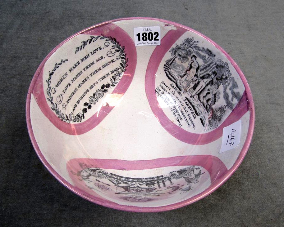
The photos below give an idea of the other transfers used with this Sailor's Farewell.
A typical Scott chamber pot with the transfer, hand-painted verse and a black and yellow frog.
Scott Brothers and Co, plate 4

The differences between these plates are miniscule. Left detail from plate 3 above. Note the distance between the side windows on the house, and the shading of the grass in the foreground. The centre detail is from the plaque in the plate 3 section above. The right detail is from plate 4. The spacing is greater between the side windows. There are more vertically shaded clumps of grass in the foreground.


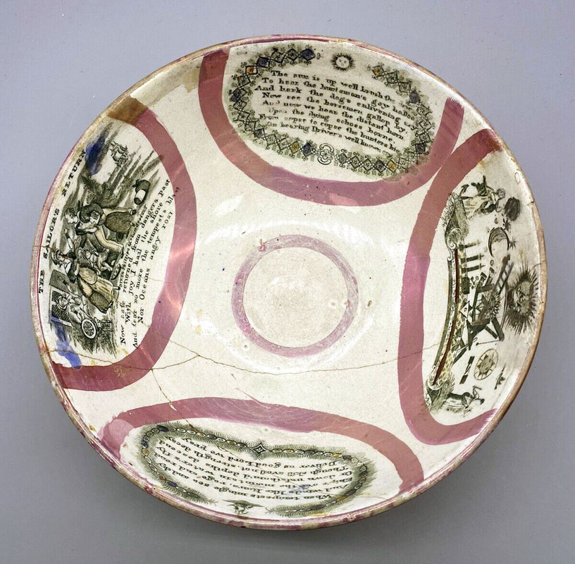
Seaham Pottery


- Cottage in background has no windows on the left, and one-up, two-down on front. The hill behind is pointed. The footpath makes a sweeping broad curve.
- There is a possessive apostrophe after the word 'sailors' in the title.
- There are no full stops or commas.


The jury is out as to whether the lid below has any place on a tankard. The transfers on the tankard are from the Seaham plate above.
Ball's Deptford Pottery
A fairly crude version of the transfer on jugs with moulded handles attributed to Ball's Pottery, c1900.

The mug below also has a handle shape associated with Ball's Pottery.
Three pink-lustre bowls with similar decoration to the mug above. The second has coloured enamels over the transfer.

An orange lustre jug of unusual form with a broad foot, again suggesting a later date, c1900.

Finally, a degraded and trimmed down imprint of the transfer (without the verse). The maroon enamel and crude decoration are typical of Ball's.